Shows artwork and thoughts mainly in pastel, acrylic and other medias.
How good is your imagination?
Get link
Facebook
X
Pinterest
Email
Other Apps
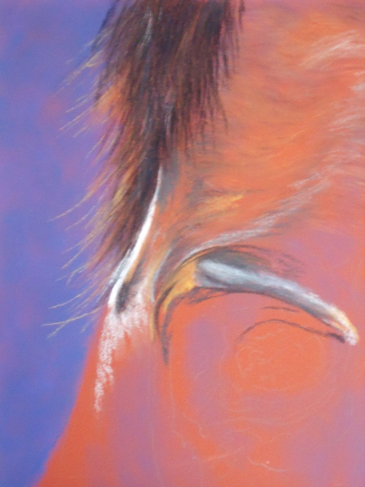
What the heck is this? I know this is a 9"x12" Colorfix terracotta sanded paper, but can you tell me what the subject is??
Counting down to the New Year, thanks for stopping by and hope you are having the best holidays with family and friends.
Hi Danielle, looks like you were the only one who checked this out. will work on it and see if it makes more sense with more information. Happy New Year!!
certainly not the neck of a young woman as i usually paint :) i guess a horse
Popular posts from this blog
Spent most of today trying to figure out why blogger won't let me comment on your comments, no matter what platform I am on. Blogger wants to say Apple's fault and Goggle wants to say Apple's fault. Will end up and email you guys as I am disgusted and still can't comment. Memories
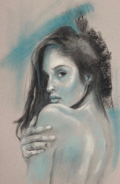
Alluring I have to admit that while I have dabbled in it, I haven't been such a huge fan of charcoal. Know a lot of the lessons I have combine paints and charcoal, and I have approached cautiously. I just don't like the dirty look, or the mud that you can easily get. Heck, I don't have any problem doing that with my paints. This week we had Robert Kelley as our instructor. This guy is a master manipulator of charcoal. He is a master. It was wonderful to watch his several hours worth of video and listen to his thought process. Of course I always seem to have to deviate. I thought I was going to try to do the straight lessons this year. But Again I have finally decided to maybe use the same reference, or not, but let "my style" try to shine through. I am not real sure what it is, but I am trying to give it free rein. So I decided to use charcoal, but also add some color. We have had nothing but days and days...
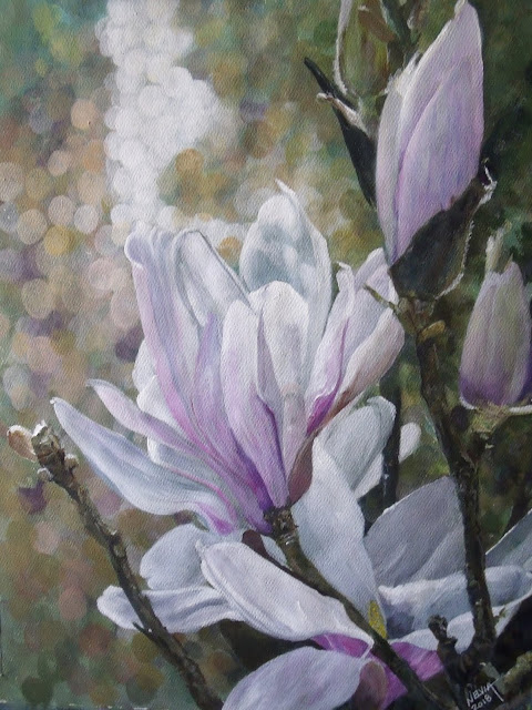
Magnolia Blossoms Acrylic 11"x14" “Talent is a pursued interest. Anything that you're willing to practice, you can do.” - Bob Ross I thought this was a wonderful quote. I don't know if it has happened to you, but people say, oh you are so talented. Not true, couldn't be farther from the truth, although I am sure there are many artists who do possess that something extra, something special. But for the most part for the rest of us, it is just a matter of studying, learning your tools and materials, practicing, and then start to trust your inner self. I am on a journey to try to find my voice. Not that I am a late bloomer, but I should have already found it, yes? I guess what I am really looking for is the way I wish and want to paint. Not necessarily how I have been doing it. I am pleased with this piece. Many thanks to Sanne who put this wonderful reference piece up at PMP. Personally I think Magno...
Comments