Posts

Showing posts from November, 2014

Looking Glass Rock, NC - Pastel BRP #1

Image
We love the Blue Ridge Parkway, a total of 469 miles, that goes through North Carolina and Virginia and follows the top of the mountain ridges.  We have been going there a couple of times a year for about 30 years and have zillions of pictures - we always say we aren't taking any more, but each time we click away.  You are supposed to draw what you know, and I have wanted to do a BRP series for a long time, so now is the time!! So, I was reading a lady on WetCanvas, who is an accomplished landscape pastel painter, she wanted to improve so she did 30 landscapes in 30 days.   Every one who read that thread got all inspired.   I decided since I didn't do the 30 day challenge last September (may try in January if Leslie Saeta does it again,)to try to see if I could do 30 landscapes of pictures that I took just this last October when the color was past peak and spotty at different elevations.  I remember when I did the January 2014 challenge that I got faster, looser and better
Just Watching - Pastel on Velour WIP

Image
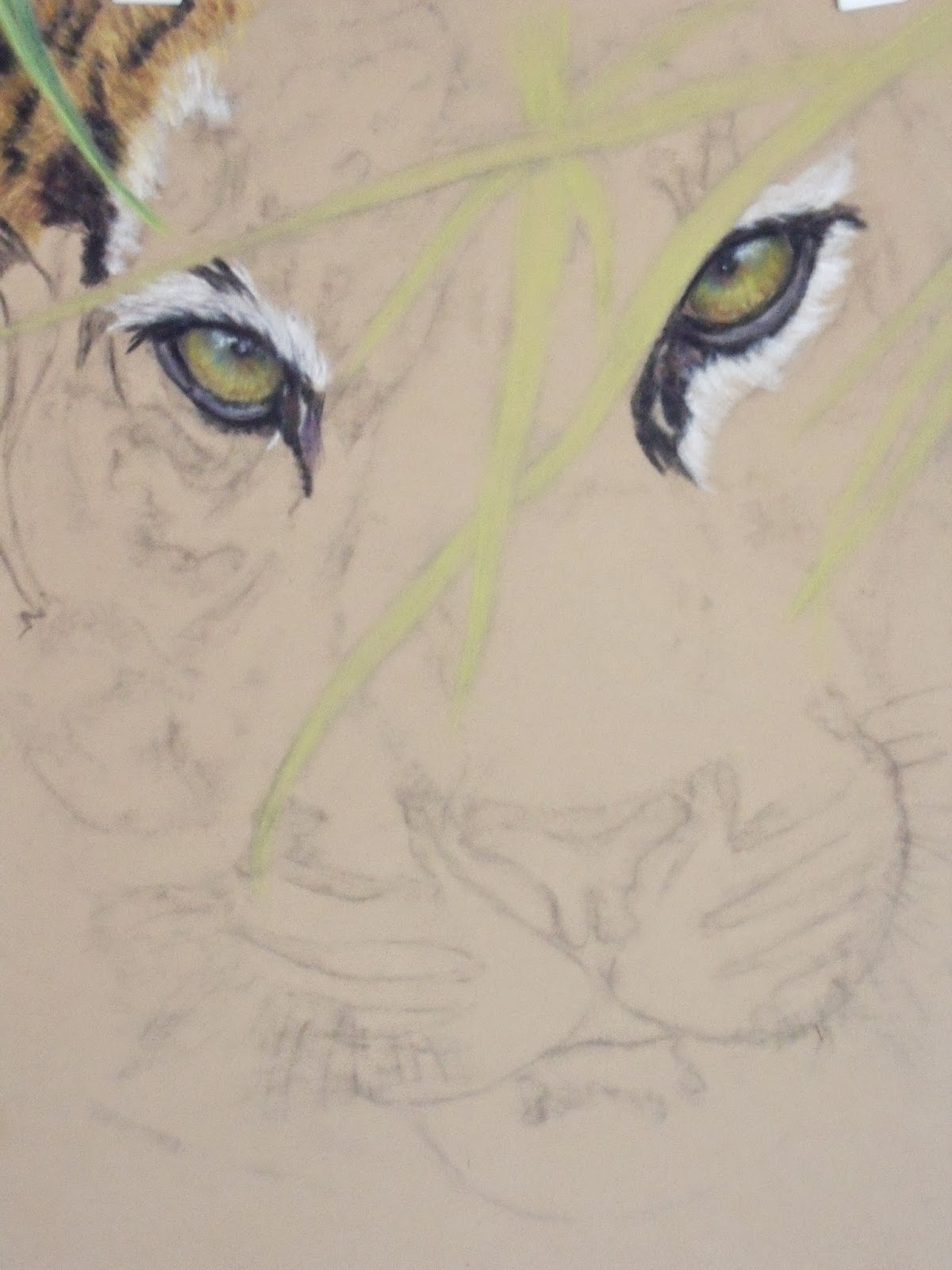
                           HAPPY THANKSGIVING - HAPPY TURKEY DAY!!   US STYLE Ah yes, I hear you, you are saying, there sure isn't much that happened here.  And you would be correct.  I had ordered myself a book written by Lesley Harrison, a wonderful wildlife pastelist.  She kind of specializes in horses and wolves and does all other manner of critters.  Anyway why I went ahead and got her book, besides the beautiful pictures, is that she primarily has worked on velour paper for the last 30+ years.  So thought she might have something to tell me that would help me figure this out.  So am taking some time to read it.   Besides it is Thanksgiving, lots of food, fun, football and stuff - so I can be lazy. You can see that I did start to try to figure out fur with this paper.  I approached it as I did with color pencil, lots of dashes of several fur colors and smoosh, then I tried laying in base colors and then took hard/sharp pastels and went over it with short choppy dashes, I

Triumphant - Osprey Color Pencil WIP

Image
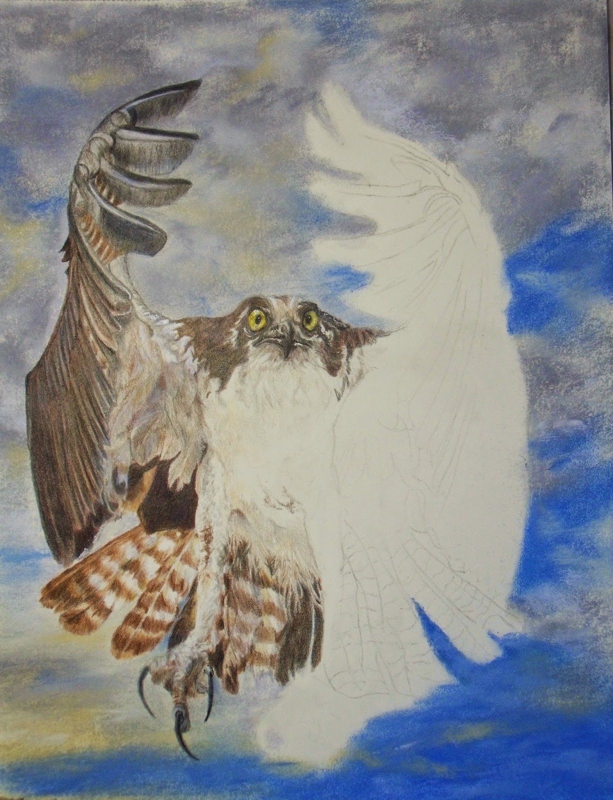
Well back at work on the lower section of the tail, this is where there are a lot of patterns and also a lot of stringy (am sure that is not the technical name) feathers that look soft and hang down.  Tried to get the pattern of these by negative drawing.  This is an important tool that I definitely need to practice more on.  With this level of detail I find myself getting pretty tight and do take a lot of breaks.  I probably am going to have to darken up the under belly, but wanted to wait to get the other leg in and develop the under the wing feathers on the right side before I darken too much.  I find it is difficult, when there is so much white on the paper, to determine how much to darken until the end.   The color adds so much that it might be correct just with the faintest of featherwork that I already have.   So am taking the sage advice to just kind of block it in and then wait (hmmm, think that smacks of patience) until I can better judge the values.  I think I am also go

Just Watching - WIP Pastel Velour

Image
This is a wonderful shot from Gary Jones, at PMP, of a Sumatran tigeress called Kirana.  I wanted to do her because she was an excellent face close up and I wanted the challenge of her beautiful eyes and features because I am working on a new support surface and I figured why not give me a chance.   I wanted to do this larger than I normally would so that I have enough space for each feature to try to do some experimental things.   I changed this shot up a bit as I am going to bravely add some leaves over her finished face to give the feeling that she is in hiding and "Just Watching".  As you know I am one of the most patient people I know - NOT.  So rather than do a lot of extensive reading and then swatch experimenting - well, I am going for it.  The paper color is a light tan/or golden beige.  The velour surface takes the pastels (am using for the first layer primarily Nupastels (hard sticks) and some pencils, and will come back with softer pastels on top of it.  You c

Triumphant - Osprey Color Pencil WIP

Image
Well this week it is back to my Osprey and I have been working on him in what seems like lots of time increments (hubby accused me of being glued to my chair).  I keep thinking about the 10,000 hours comment that you need to put in before you start to get it, whoa, with color pencil I think I must be getting close as for me it is a slow process.  But alas, too, been busy trying to clean house now that the heat is on the dust, it is aflying!!!  Also with Christmas coming I kind of want to spruce things up, as I know before I am ready the holidays will be here. Since we have the 12 Days of Christmas cooking coming up (this is hubby's annual tradition and we eat from around the world)  I needed to clean the kitchen, degreasing, so new grease has got a place to go.  But not complaining because I am the receipent of all the good food.  (So got to increase the exercise regime and better start now!!) Anyway here is the Osprey with the main wing panel being worked.  In the reference

Mr. & Mrs.

Image
I know this is elementary for many of you, but it required a "happy dance" when I accomplished it.  You might recognize Iblis from a pastel value study I did of him back in June, I think.  Well in GIMP I combined Iblis with another photo of a female lioness that I have been wanting to do.  I found a really good YouTube video that used the eraser for getting rid of the background and boy was that easier than cutting around her.  I kind of like the two different effects of B&W and color together, (actually thought about doing it that way) but hubby said too distracting. Since I have one in color and one in B&W I am doing this pre-painting study in graphite to get a good strong value study and I can utilize a limited palette when I go to color.   This is being done on a piece of mat board that is kind of bright orange which is kind of the body color of a lion.  But for some reason the camera isn't picking this up.  Maybe if we ever warm  up I can get a sun pict

Pink Done?? Need some Name Ideas

Image
  Well I have Pink to the stage now that he is going to sit on the easel for a bit while I decide whether or not to add more color in the feathers on the body.  The reference photo is even lighter than what I am reflecting here, and thi shot doesn't show the colors as dark as they are in real life.  I do have some other reference photos where the flamingos have much more dramatic coloration on the neck and some of the body feathers.  Will study those and determine whether I can and want to add that much color in.  If anyone has some name suggestions please comment as I am not sure that "Pink" does it. Thanks for stopping by and hope you are having a great week.

Licorce ACEOs

Image
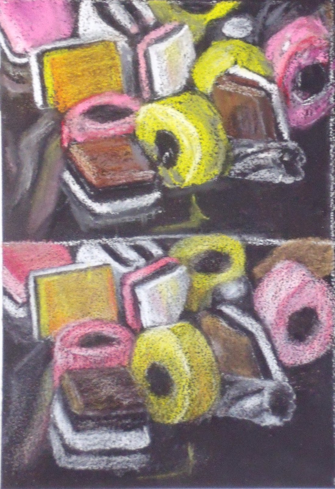
Not having any formal art education I tend to do a lot of reading to learn techniques, gain ideas, be awed by what others are doing, and get inspiration.  So I gave myself this year, 2014, to just try anything before I settle down into something and stick with it (whatever that might be).  Anyway I am reading an e-book from Nicole Caulfield about how she uses color pencil on sanded paper.  She creates portraits that look like Rembrandt, using the fade-too-dark edges and dramatic lighting - believe it or not, with color pencils.  I have worked with pastel for many years, but very little with sanded paper, pastels is the main media using this type of support, or so I thought.  Hilda - do you use it?  If so what brand do you utilize. There are only several types of sanded paper out there (yes, it is an archival type of the sand paper found in hardware stores) from moderately expensive to what I call expensive, $10/sheet.  However, you can make your own.  Many manufacturers have pumice

Pink WIP

Image
Had to get back to something more productive.  I spent yesterday trying again to get Kharys on paper and catching a likeness.  While I like some things about the pictures I did, it still isn't right.  So am going to give it a break and then try again maybe next week, I still have the back of the paper and can get two more watercolor heads on there.  I did enjoy the break with the watercolor, makes me appreciate the dry media of either pastel or CP as it stays where you put it!! I finally got myself in gear this morning and decided today was going to be Pink day.  About 4-5 hours of work here today.  Just went out to catch a shot in sunshine, forgot that with the time change the sun goes behind the trees and my usual shooting place is shade, not a good picture.   So this is shot while on my easel with sunlight from the west windows, on upper floor still gets sunlight, and my interior daylight bulbs.  Hope it comes out sort of accurate when blown up. Had to do a little literary

Kharys

Image
How do you watercolor people do it?  Ok, you got to understand that this comes from a person who got in line twice for hips because I thought patience sounded boring.  But this really makes you start, stop, wait, hit it, stop wait, etc..... I have been trying to get Kharys on paper for quite a while.  I have been trying since I originally drew up Jania to get a decent starting drawing for a picture.  I knew right away that Kharys was going to be the toughest of the two girls because I just couldn't get her eyes quite right - she has these elfin eyes, at least in this reference.  But thought today would be my waterloo, as I am not excited about Pink or Triumphant, I was going to conquer Kharys.  Yeah, hold that thought. Then I thought I'd make it more difficult and would try her in watercolor (been watching YouTube videos again!!  Boy they make it look easy)  Ok, so watercolor isn't something you just decide to start without lots of practice, say 10 or 15 years.  Anywa

Pink and Triumphant Update

Image
Well got a little farther on each of these.  I like having both of them to go back and forth on because they are intense and it gives me a break, just in a different way. Really wanting to add more color to Pink's head for definition, as it comes back down into the body it will get lighter pink then blending to white in some of the feathers.  Am now going to add in the neck/chest feathers and then decide how much darker/more color I want to add into the head.  Think that the shadows still need to get darker so that they pop out the highlights more, also shadows needs to be much more precise and delicate to try to make the feathers look fluffy. I added in the sky tones in the background on the Osprey, Triumphant, and used pastels because of their blendability.  Also I can then use a CP to make sure that the sky tones come right into the feathers and don't leave that pasted on white line around the bird.  I will work over it and lighten the whole sky back up once I get the