Posts

Showing posts from 2014

HAPPY NEW YEAR - 2015

Image
HAPPY NEW YEAR!!!!! Wow, here we are at 2015 and a whole new year to do and accomplish what we want to do.  Hope everyone has a safe, healthy and happy New Year.  Look forward to seeing you all during the next year and watching what you make happen.

How good is your imagination?

Image
  What the heck is this?  I know this is a 9"x12" Colorfix terracotta sanded paper, but can you tell me what the subject is?? Counting down to the New Year, thanks for stopping by and hope you are having the best holidays with family and friends.

Merry Christmas Everyone

Image
                                                                                                            MERRY CHRISTMAS TO YOU ALL I just love nutmen and we have our entire Christmas tree done in the Nutcracker theme.  So here is my color pencil nutman wishing you all the most joyous Christmas with your friends and family. Thanking you all for the comments, support and interest during this past year.   It certainly makes it much easier to go forward knowing that you are out there.

Mr. & Mrs. Pastel Final

Image
Mr. & Mrs. 9"x12" Pastel on Velour Paper Here is what I think is going to be the final picture of this year just because this next week looks pretty busy.  Boy, what a year for so many things, art included.  In so many ways it seems like it just flew by, but when I start to evalutate 2014 I am sure I'll feel I accomplished many things (that's another upcoming post).  But I wish it would slow down just a little.  But 2015 here we come!! Thanks again to Gary Jones who shot both of these beauties.  I combined both photos, one black and white and the other color in GIMP, gray scaled both and then found other color references of Ibis to try to get his coloration in.  Paul got some great pictures at the Washington National Zoo of their lion pride so hope to do some of their lions too. I am hoping that I am starting to get the hang of this paper and that maybe the next picture will be more cohesive as far as technique.  I find that I am changing the pastel a

Mr. & Mrs. Pastel WIP

Image
I am continuing to work on the male lion as I get the color tones laid into the lioness.  I want to be sure that I have common colors between the two of them.  I have been using a stipple brush to do some of the blending, very lightly, as it really kicks up dust, but it does help to take some of the stoke away and blend overall - trying to blend with fingers on the velour is pointless as nothing moves.  Still have quite a bit to do but like the way the lioness is coming together. Looking at this I still think I need to put the right side of the male's face more into shadows colors.  Will start to gradually do that as I don't want it all gray, but have color peeking through.  I am guessing that if I can get it to the right value and color it should help the lioness pop out as being forward of the male.  Had to take a bit of a break this week to do tablecloths and napkins for next week.  Sewing is kind of artistic??   Anyway, while not something intricate it still took a go

Mr.&Mrs. Pastel WIP

Image
    Here is an update on my lion friends and I am really not sure I am happy with the way this piece is going.  I am on the second try on this velour paper and I must admit it is very strange and I am not sure yet that I really like it.  (I really miss being able to blend, I guess it covers a lot of errors)  In my reading a lot of people have switched from velour to pastelboard.  However I thought that pastelboard is more like sanded paper, but I may be incorrect.  I keep losing my underdrawing and then the colors look fine one second and then they go dead, just like the paper swallowed it.  Also this support creates quite a bit of dust so I have gone to my using air purifier and a mask.  I am using the color of the paper as some of the color of the lion and maybe I would have a different experience using more of a complementary color.  The good thing about putting a shot on the computer screen is being able to see major errors, for me it brings some objectivity. Goal now is t

Mr.&Mrs. Pastel WIP

Image
      Ok, this is the start of Mr. & Mrs., my double lion portrait, on golden yellow velour paper, 9"x12".  This is a combination of two photos from Gary Jones at PMP.  The male was in black and white and female in full color, so I am working the male from value studies I did plus using other lion reference photos to try to get his colors correct.  Colors will be the same for both so hoping to keep it cohesive. I can already see that this is going to photo differently than what it is in real life as the photo background looks blue and it actually is a blue green.  I will try to take the next pics outside so it might translate better.  But, heck it's cold. I mounted this velour paper to the same size of acid free foam board, I didn't have the adhesive sheet, so used 3M Super 77, liberally spraying both the board and the back of the velour sheet.  It seems to have bonded pretty good.  I let it dry overnight so it was good and setup before I started app

Watching Finished Tweaks

Image
 Watching   Ok, here is the tigress with her final tweaks where I changed some of the color zones - hoping you can't really tell the differences.  Don't think I am going to do anything else to her but put her in a frame.  Let's talk about this unique way of framing pastels....... Am going to try to frame as Leslie Harrison suggests.  One thing she does I didn't know to do initially was put this piece of velour on foam board before you start painting - next one definitely as velour paper is rather thin and could wrinkle.  Anyway you put velour on board or acid free foam board using a sheet of double-sided adhesive.  Paint away - Then she thoroughly cleans the glass and puts the picture right against the glass (usually in pastel you use the mat space to act as a dust catcher) and then puts in her brads to the frame to make it snug.  She says you get a little dust but she doesn't have any issues.  Hoping for no issues as this isn't going to be snug on the bo

Watching - Tiger, Finished

Image
Watching  9"x12" Pastel on Velour Well I think that "Watching" is pretty much complete.  As usual I am going to let him sit on the board and rest a couple of days and then I can do tweaks to him.  I think I see a few of the markings that I'd like to change, especially that longer tough hair just around the neck area.   But want to get some distance first, too many hours in this to try to radically change and ruin the piece.  Know that I need to keep going over the whiskers to get them whiter and with more substance.   I will admit that I tried whiskers with pastel and couldn't get the lines thin enough, so ended up using the trusty Sakura white gel pen and keep going over them as the velour sucks it up.  All the experts say sharpen the pastels - well I just don't know who to get it that sharp!! Why is it with pictures you like some parts and hate others?  Do you think anybody gets it all where they like it? As always happens when I get done wi

Watching - Tiger More WIP

Image
Well continuing to work on this tiger.  Even though velour seems to take color pretty fast I find I am working lots of hours without looking like I am making progress.   I find that I keep adding additional layers to what I have already worked, still trying to get that individual hair look.  Think I may have been lucky and able to mask my error at the top of the head, thank goodness each tiger has different random markings. I had to freshen up the left eye as well, and you can really tell the difference between the two eyes.  It seems that even though I am trying not to lay anything or put hands on areas that have been worked, the color I guess gets imbedded into the velvety paper, dulls and needs to be touched up a bit.  Today's time has been spent trying to get the muzzle to come forward away from the flat plane of the face.  I also have to get some more references on what the nose looks like as I am not happy with this, it matches my reference, but doesn't look finishe

Watching - Tiger WIP & Question Need Help

Image
Ahhh, boy does it feel a lot better doing something more inside my comfort zone.  Just couldn't make myself deal with green today (ok there is a little I did on this, but not like the landscapes).  Decided even with the velour I was going back to work on Watching.  Saw a documentary last night on lions with some previews of a tiger show to come and got excited. Speaking of the velour, I think I quite like that surface a whole lot better than the sanded paper.  I am going to try several other brands and the pastel mat as well to see if I can find a surface that feels smoother.  I got more Colorfix sheets to have to use up, so there will be more pics on it and maybe by the end I'll know what to do with it.  Fingers crossed. Today was sketching in definitions, where the black and white zones should be to form the cheek and muzzle areas.  Still playing with underpainting on the beige zones - I am still undecided on what the color and order lay down should be for those areas. 

30 BRP #3 - Looking Glass Falls

Image
Ok, so I know I am cheating a little bit, this is Looking Glass Falls and I know it's on Rt 276 and not the Blue Ridge Parkway, but it is just down the mountain.   It is such a beautiful falls, well visited because it is just right off the road, no hiking is required.  Even season shows more tree growth and a different amount of water coming over the falls.  Imagine, this water cascades 24 hours a day 7 days a week. I have wanted to do this falls for many years, but was chicken and intimidated, but decided today - what the heck.  This is still on sanded Colorfix dark gray paper and it still seems grainy to me.   I am going to try some of the Bristol baord I can make using clear gesso as it might be a little finer. I still am struggling with how to get the effect I would like with this paper.  I do however like how it gives the speckled look for the water going over the rocks.  I can see I still have lots to learn about making leaves.  Guess I better pull out my landscape book

30 BRP Paintings #2 - Looking Glass Rock

Image
      Well Folks you are going to see the bad and the ugly.  This is the fourth shot of this second landscape of the series, the frontal side of Looking Glass Rock and it is taken from the Blue Ridge Parkway around Mile 418.  I keep reworking it because I am not happy with it, but I have to stop now.    I think one of the things that isn't working for me is getting the values in the right place.  John F. Carlson says to make a landscape work you need values to: 1)  1st value is the lightest value which is the sky (because I have such a stormy mood in this this doesn't hold true for the entire sky 2)   2nd lightest value is the land or ground plane, which directly reflects the light of the sky - think I got this with the last mountain ridge 3)  3rd value which is darker than the first two values is the slanted planes, mountains, slanted rocks, hills, etc get less light 4)  4th value, which is the darkest should go on upright planes, trees, buildings and othe

Looking Glass Rock, NC - Pastel BRP #1

Image
We love the Blue Ridge Parkway, a total of 469 miles, that goes through North Carolina and Virginia and follows the top of the mountain ridges.  We have been going there a couple of times a year for about 30 years and have zillions of pictures - we always say we aren't taking any more, but each time we click away.  You are supposed to draw what you know, and I have wanted to do a BRP series for a long time, so now is the time!! So, I was reading a lady on WetCanvas, who is an accomplished landscape pastel painter, she wanted to improve so she did 30 landscapes in 30 days.   Every one who read that thread got all inspired.   I decided since I didn't do the 30 day challenge last September (may try in January if Leslie Saeta does it again,)to try to see if I could do 30 landscapes of pictures that I took just this last October when the color was past peak and spotty at different elevations.  I remember when I did the January 2014 challenge that I got faster, looser and better

Just Watching - Pastel on Velour WIP

Image
                           HAPPY THANKSGIVING - HAPPY TURKEY DAY!!   US STYLE Ah yes, I hear you, you are saying, there sure isn't much that happened here.  And you would be correct.  I had ordered myself a book written by Lesley Harrison, a wonderful wildlife pastelist.  She kind of specializes in horses and wolves and does all other manner of critters.  Anyway why I went ahead and got her book, besides the beautiful pictures, is that she primarily has worked on velour paper for the last 30+ years.  So thought she might have something to tell me that would help me figure this out.  So am taking some time to read it.   Besides it is Thanksgiving, lots of food, fun, football and stuff - so I can be lazy. You can see that I did start to try to figure out fur with this paper.  I approached it as I did with color pencil, lots of dashes of several fur colors and smoosh, then I tried laying in base colors and then took hard/sharp pastels and went over it with short choppy dashes, I

Triumphant - Osprey Color Pencil WIP

Image
Well back at work on the lower section of the tail, this is where there are a lot of patterns and also a lot of stringy (am sure that is not the technical name) feathers that look soft and hang down.  Tried to get the pattern of these by negative drawing.  This is an important tool that I definitely need to practice more on.  With this level of detail I find myself getting pretty tight and do take a lot of breaks.  I probably am going to have to darken up the under belly, but wanted to wait to get the other leg in and develop the under the wing feathers on the right side before I darken too much.  I find it is difficult, when there is so much white on the paper, to determine how much to darken until the end.   The color adds so much that it might be correct just with the faintest of featherwork that I already have.   So am taking the sage advice to just kind of block it in and then wait (hmmm, think that smacks of patience) until I can better judge the values.  I think I am also go

Just Watching - WIP Pastel Velour

Image
This is a wonderful shot from Gary Jones, at PMP, of a Sumatran tigeress called Kirana.  I wanted to do her because she was an excellent face close up and I wanted the challenge of her beautiful eyes and features because I am working on a new support surface and I figured why not give me a chance.   I wanted to do this larger than I normally would so that I have enough space for each feature to try to do some experimental things.   I changed this shot up a bit as I am going to bravely add some leaves over her finished face to give the feeling that she is in hiding and "Just Watching".  As you know I am one of the most patient people I know - NOT.  So rather than do a lot of extensive reading and then swatch experimenting - well, I am going for it.  The paper color is a light tan/or golden beige.  The velour surface takes the pastels (am using for the first layer primarily Nupastels (hard sticks) and some pencils, and will come back with softer pastels on top of it.  You c

Triumphant - Osprey Color Pencil WIP

Image
Well this week it is back to my Osprey and I have been working on him in what seems like lots of time increments (hubby accused me of being glued to my chair).  I keep thinking about the 10,000 hours comment that you need to put in before you start to get it, whoa, with color pencil I think I must be getting close as for me it is a slow process.  But alas, too, been busy trying to clean house now that the heat is on the dust, it is aflying!!!  Also with Christmas coming I kind of want to spruce things up, as I know before I am ready the holidays will be here. Since we have the 12 Days of Christmas cooking coming up (this is hubby's annual tradition and we eat from around the world)  I needed to clean the kitchen, degreasing, so new grease has got a place to go.  But not complaining because I am the receipent of all the good food.  (So got to increase the exercise regime and better start now!!) Anyway here is the Osprey with the main wing panel being worked.  In the reference

Mr. & Mrs.

Image
I know this is elementary for many of you, but it required a "happy dance" when I accomplished it.  You might recognize Iblis from a pastel value study I did of him back in June, I think.  Well in GIMP I combined Iblis with another photo of a female lioness that I have been wanting to do.  I found a really good YouTube video that used the eraser for getting rid of the background and boy was that easier than cutting around her.  I kind of like the two different effects of B&W and color together, (actually thought about doing it that way) but hubby said too distracting. Since I have one in color and one in B&W I am doing this pre-painting study in graphite to get a good strong value study and I can utilize a limited palette when I go to color.   This is being done on a piece of mat board that is kind of bright orange which is kind of the body color of a lion.  But for some reason the camera isn't picking this up.  Maybe if we ever warm  up I can get a sun pict

Pink Done?? Need some Name Ideas

Image
  Well I have Pink to the stage now that he is going to sit on the easel for a bit while I decide whether or not to add more color in the feathers on the body.  The reference photo is even lighter than what I am reflecting here, and thi shot doesn't show the colors as dark as they are in real life.  I do have some other reference photos where the flamingos have much more dramatic coloration on the neck and some of the body feathers.  Will study those and determine whether I can and want to add that much color in.  If anyone has some name suggestions please comment as I am not sure that "Pink" does it. Thanks for stopping by and hope you are having a great week.

Licorce ACEOs

Image
Not having any formal art education I tend to do a lot of reading to learn techniques, gain ideas, be awed by what others are doing, and get inspiration.  So I gave myself this year, 2014, to just try anything before I settle down into something and stick with it (whatever that might be).  Anyway I am reading an e-book from Nicole Caulfield about how she uses color pencil on sanded paper.  She creates portraits that look like Rembrandt, using the fade-too-dark edges and dramatic lighting - believe it or not, with color pencils.  I have worked with pastel for many years, but very little with sanded paper, pastels is the main media using this type of support, or so I thought.  Hilda - do you use it?  If so what brand do you utilize. There are only several types of sanded paper out there (yes, it is an archival type of the sand paper found in hardware stores) from moderately expensive to what I call expensive, $10/sheet.  However, you can make your own.  Many manufacturers have pumice

Pink WIP

Image
Had to get back to something more productive.  I spent yesterday trying again to get Kharys on paper and catching a likeness.  While I like some things about the pictures I did, it still isn't right.  So am going to give it a break and then try again maybe next week, I still have the back of the paper and can get two more watercolor heads on there.  I did enjoy the break with the watercolor, makes me appreciate the dry media of either pastel or CP as it stays where you put it!! I finally got myself in gear this morning and decided today was going to be Pink day.  About 4-5 hours of work here today.  Just went out to catch a shot in sunshine, forgot that with the time change the sun goes behind the trees and my usual shooting place is shade, not a good picture.   So this is shot while on my easel with sunlight from the west windows, on upper floor still gets sunlight, and my interior daylight bulbs.  Hope it comes out sort of accurate when blown up. Had to do a little literary

Kharys

Image
How do you watercolor people do it?  Ok, you got to understand that this comes from a person who got in line twice for hips because I thought patience sounded boring.  But this really makes you start, stop, wait, hit it, stop wait, etc..... I have been trying to get Kharys on paper for quite a while.  I have been trying since I originally drew up Jania to get a decent starting drawing for a picture.  I knew right away that Kharys was going to be the toughest of the two girls because I just couldn't get her eyes quite right - she has these elfin eyes, at least in this reference.  But thought today would be my waterloo, as I am not excited about Pink or Triumphant, I was going to conquer Kharys.  Yeah, hold that thought. Then I thought I'd make it more difficult and would try her in watercolor (been watching YouTube videos again!!  Boy they make it look easy)  Ok, so watercolor isn't something you just decide to start without lots of practice, say 10 or 15 years.  Anywa

Pink and Triumphant Update

Image
Well got a little farther on each of these.  I like having both of them to go back and forth on because they are intense and it gives me a break, just in a different way. Really wanting to add more color to Pink's head for definition, as it comes back down into the body it will get lighter pink then blending to white in some of the feathers.  Am now going to add in the neck/chest feathers and then decide how much darker/more color I want to add into the head.  Think that the shadows still need to get darker so that they pop out the highlights more, also shadows needs to be much more precise and delicate to try to make the feathers look fluffy. I added in the sky tones in the background on the Osprey, Triumphant, and used pastels because of their blendability.  Also I can then use a CP to make sure that the sky tones come right into the feathers and don't leave that pasted on white line around the bird.  I will work over it and lighten the whole sky back up once I get the

Various Birds WIP

Image
    Ok, between sneaking off to the mountains to see the Fall colors (it had unfortunately gone past peak in many elevations), attended a big time craft show and being under the weather for a few days when I got back, there hasn't been a great deal of work going on artwise.  But here is an update on a new piece which I thought was just an awesome Osprey shot.  It is from PMP and Sandy who is quite a wonderful wildlife photographer out of Florida.   He caught this Osprey in full flight with his catch of the day.   I am going to call it "Triumphant".   This will be another color pencil on Stonehenge paper, 11"x14". I started it because when I drew him up I was really pumped, but laid him away and now since I was frustrated with both trying to get Khrys drawn for another portrait and not being particularly excited about Pink I figured well, why not.  So figure now I will have multiple things to be frustrated about...... LOL Once I got rolling with the

Weaving Upddate WIP

Image
Haven't given you an update on my weaving lately, so here it is as of today.  Yep, when I said it was slow, I meant it goes really slow, it takes two lines of yarn to complete one row (kind of like the knit/purl routine) that you see on the front side, so......  Not sure but I am pretty sure grass grows faster in the winter than this is going.  I am pretty excited with this one, I intentionally kept it simple, very few color changes, but I really am liking this, even hubby is enthused with this one.  I am toying around with adding a different color pink or peach at the top of the sky before I move into a steel blue night color, but just debating at this point.  You can see on my original cartoon where I have the bright red pops in the blue portion.    Just think that the transition to a softer, paler color may be more realistic.  Boy I do like that the pine trees are silhouetted and am going to have to remember to build in maybe more sky holes in the mass areas to keep it real.

Cheetah Sketch

Image
The other day I suggested you might check out wetcanvas.com, I was going to do that to check out info on drawing feathers and didn't find much that would help me with Pink.   Well I took my own advice and ended up finding a thread on drawing wildlife with charcoal and chalk, check Drawing and Sketching/The Classroom/Basic 102: Wildlife in charcoal ad chalk.  Well after 17 pages of conversation and people posting pictures, I got charged up and came up and drew up this sketch in about an hour and a half.  What I wanted to accomplish with this sketch: 1)  Measure, since this is a portrait I measured, using my handy dandy ruler to get not only spacing, but size and angles.  This part probably took me about 30 minutes, but felt comfortable with my base 2)  Limited palette of:  vine charcoal, General white charcoal pencil, orange-ish light dark pastel (all my pastels are arranged by values) and 2H and 9XXB graphite pencils (seems like I always have to get graphite in there somewhe

Georgia Blossom

Image
I almost called this "Lucky Blossom" because under several layers there are koi fish swimming around.  But I figured only a few people would get the joke and I didn't want to air my dirty laundry to the whole world, just you guys dear readers know the actual truth.  So instead I went with Georgia Blossom as we get magnolias blooming both in Spring and Fall here in Georgia.  They are such beautiful flowers.  Another one I think I could paint again and again and not get tired of them.  Love that white really isn't white with this flower.   I had done a magnolia before in color pencil in a 12"x12" size, but altered this one a bit (not using grays for the shadows, but violet and blues) and did it on a 6"x6" boxed canvas.  Again working on getting the sides to participate as part of the composition.  I did a couple of things here:  1) I covered the koi with several coats of gesso and realize that gesso doesn't allow the paint to soak into

Pink WIP

Image
Not exactly sure how to approach this one, but thought I'd start at the bottom and kind of work my way up through the feathers since they all sort of overlap a bit.  Also trying to give some of the fine line work and sleek lie to the feathers that you see in real life, but still that little bit of texture.  I am finding that is a bit of a challenge.  I am hoping that by the time I complete Pink I will have a technique and then I think I better write it down (alas, senior moments my friends) as there was so much time between my eagle I think I forgot what I did.  I am then going to go forward after this one and try my scratchboard egret before I forget what I did, however that one is lots softer feathers.  I also have a reference of mine that is a black swan and I'd kind of like to try that as well - sort of a feather clinic.  Hopeful I will be smarter at the end of it and not feel intimidated by them.  Have to admit when I looked at this reference I was so excited with all t

Jania Finished

Image
Ok, I think I am pretty much completed with Jania.  She will sit on the board and watch what I'm doing for the next couple of days and hopefully tweaks will be done only as needed.  I can always find tweaks, pick out lights or add more darks and already see some of those, but have been at it too much today and want fresher eyes before I make any adjustments.  (As I look it's not what you'd call a real centered picture here, sorry, but had to wait for the rain to stop and now too lazy to walk back downstairs and take another that might be more centered).  Did you ever notice how when in the sun you can't see what you are taking a picture of because you can't see the screen? Anyway, darkened her hair up (but it might need more), added more facial color overall and then more darks to try to give a little definition to her headpiece.  Sorry Jane, wasn't a lot I could do with the lips being too long, tried to take some off, but it was pretty imbedded in the paper

Muck and Mire

Image
Ok, airing dirty laundry here, but I have spent a couple of days working on these koi fish on a gallery wrap canvas and quite honestly it is such a pathetic result that there ain't no way to salvage it.  I am and have been stuck in the muck and mire with these fish.  There are just so many things wrong with this attempt (poor proportion, muddy colors, poor composition, etc, etc) that I am going to have to gesso it over, sand and gesso some more and hopefully forget what's lurking underneath.  Then I am going to try to paint my magnolia one more time in acrylic or maybe a hibiscus.  They, like the poppies are such a beautiful flowers.  Yes dear readers we all have bombs, but I guess we learn from them, although I am not sure there is any positive to take away from this muddle. But there is good news.  I have been letting my brain and Jania rest on my board for a couple of days.  After being disappointed in some of my measurements, I corrected what I thought I could get away w

Poppy Twins

Image
Just an awesome beautiful morning here in Georgia - had some rain, finally, and a cold front pushed through 45 degrees this morning!!!    Sorry the picture quality that isn't that good, but my camera battery was dying on me and I auto adjusted the pics since the shutter speed was sloooooow and they were kind of fuzzy.  They aren't quite this orange in real life and I kind of have angles and a bit of glare as wanted to show the sides.  Am thinking this might be the first of several I try to do that would be in the 6"x6" wrapped canvas with acrylic.                                                                               I have been looking for an alternative to get to a lower price point.  Since most of what I have done previously has been on paper, it is hard to hit a lower price point as you have to absorb the cost of matting and framing.  (Personally I think framing costs are way expensive and cheapest I can come up with for a decent size, 11x14, is $50. 

Jania Portrait WIP

Image
TODAY'S ADVICE: MEASURE, MEASURE, AND MEASURE Decided I would leave the picture in as it was yesterday when I was ready to stop because I had lost Jania.  Was getting ready to start over because I won't be defeated, but experience tells me to put her on the board and just look at both reference and picture and note the differences.  Top picture is this morning with a few changes, plus put in some additional definition on the light side of her face.  Just standing back and studying the two shots I had identified what I thought were correctable  reasons for the aging distortion (remember I had several of these issues when I did the original drawing):  1) part of the face was just lightly colored in,  no definition to balance the more finished shadow side, 2) the jaw on both sides needed to be reworked to regain the shape from the shadow, 3)  lengthened the chin,  4) shortened the nose; which gets me to today's advice.   I thought I had the features set, map

Pink - Portrait WIP

Image
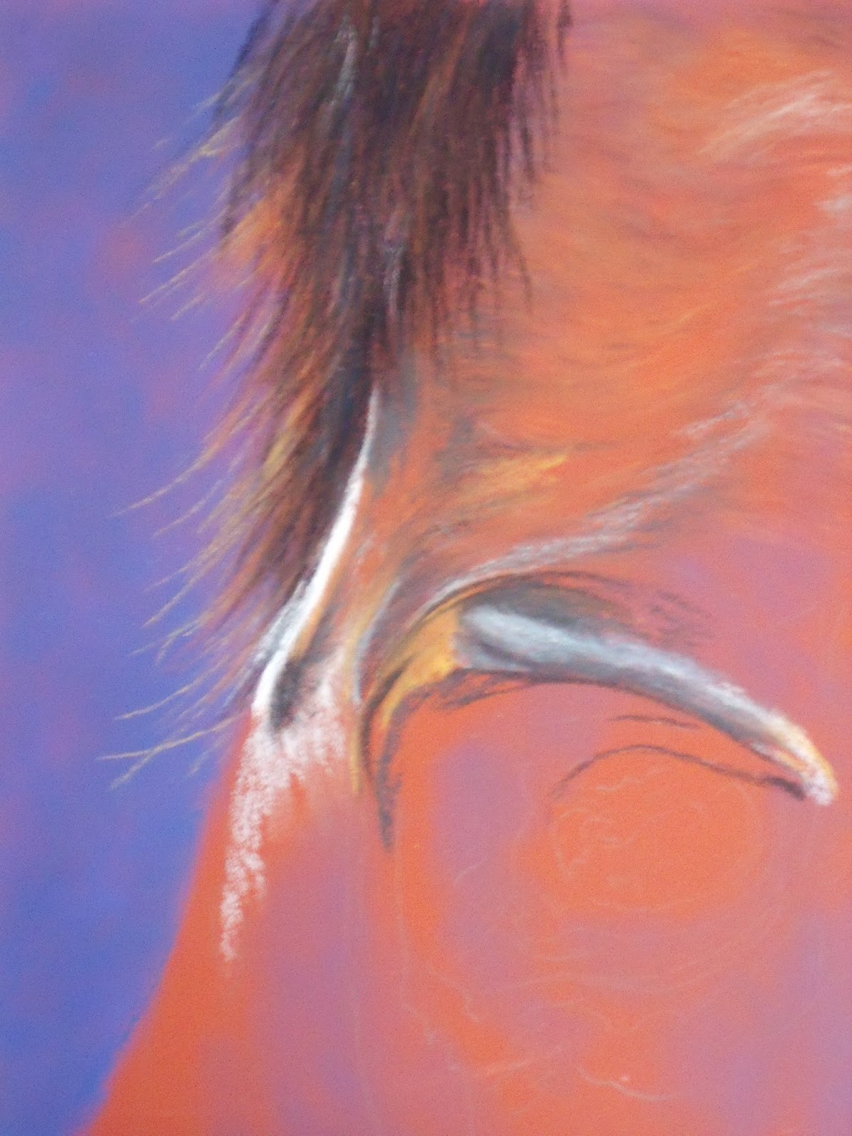
Here is my Pink portrait, I am guessing that most of you have figured out what it is going to be now that I have added the eye and the beak (we hope), at least it is a little clearer today.  I have been going back and forth between two paintings, this Flamingo and Jania most of the day and feel I made some progress on both.  However, I find that I tend to get all engrossed, then hunched over as I am really concentrating on what I am doing.  Then I end up with a crick in the neck and back, etc, well blah, blah on that.  But most importantly I got to tell you I don't know where the day goes, it's lunch then wosh, it is dinner.  Have to tell you I never really realized what a funky eye a Flamingo really has, and also if you check the beak closely, when is black not really black.  I also thought they had a smooth hooked beak, but upon closer inspection, it is actually gooved on the sides.  Can't wait to get into the delicious colors.  Learned today that the Flamingo is the