Shows artwork and thoughts mainly in pastel, acrylic and other medias.
Get link
Facebook
X
Pinterest
Email
Other Apps
Winter's Day
Well have to thank both Sheila and Diane for nominating me to do black and white photos because it got me back to Blogger which has changed since I was last using it.
Haha, :) Why can't they just leave things alone. I just updated my phone, and now things are wonky and I have to learn it all again. Haha. Oh, this scene looks lovely. I am sitting here, thinking I might need some ice cream to cool down. 97 degrees. Thanks for sharing Nelvia!
I am also on blogger and so far I staying with what they NOW call LEGACY. Was called CLASSIC. Love your photo has a nice composition. What theme do you use?
Beautiful scene, Nelvia. Yes, blogging has changed so much, right?.... I imagine its because everyone is on facebook since its faster, easier.....however, I like to blog and still do!!
Shades of Pink This is kind of a culmination of lots of things I have been working on for the last couple of months. It started with a photo I liked, putting it into GIMP I wanted to put it into color dropper and see what colors/tones were coming up. They weren't quite striking enough so I then went to adjusting the color curves. Came up with several options that I really liked. Thought it might be a great fun way to better learn how to mix colors and do a little mini series as well. Going to call it Shades of.... Then it was back into oils. I kind of am addicted to them now that I got through the first painting. I do really like how they blend. Currently am using a styrofoam meat tray as my palette so I can just toss it when it is to messy to clean. However this was more complex or something and I wasn't able to get it finished in just one sitting. So I needed to utilize some of the painting medium for my oil...
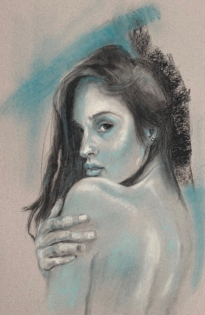
Alluring I have to admit that while I have dabbled in it, I haven't been such a huge fan of charcoal. Know a lot of the lessons I have combine paints and charcoal, and I have approached cautiously. I just don't like the dirty look, or the mud that you can easily get. Heck, I don't have any problem doing that with my paints. This week we had Robert Kelley as our instructor. This guy is a master manipulator of charcoal. He is a master. It was wonderful to watch his several hours worth of video and listen to his thought process. Of course I always seem to have to deviate. I thought I was going to try to do the straight lessons this year. But Again I have finally decided to maybe use the same reference, or not, but let "my style" try to shine through. I am not real sure what it is, but I am trying to give it free rein. So I decided to use charcoal, but also add some color. We have had nothing but days and days...
Nicolae's Giraffe Over the years we have decided the places we like to visit and have gone back multiple times. In this day and age I think it is uncommon that in a hotel environment the workers would have been there 10-35 years. So friendships develop. Each of the people we have encountered have made our stays extra special in a variety of ways. One of the ladies that works the check in desk had a baby last year. Since we were unable to go in November we just saw her when we were in DC. He is now 14 months, and in love with giraffes. She has a yellow and gray nursery decor and I wanted to do a giraffe. Wasn't sure if it should be the "kiddie" kind, but thought he might outgrow it. So I decided to do one semi realistic so that he wouldn't outgrow it right away. Aren't they just the strangest looking animal? I always wish I would keep my mouth shut, because it does worry me when I say I will paint something - it ...


Comments
Love your photo has a nice composition. What theme do you use?