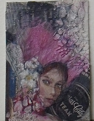
Junk ATC
This is a continuation of an ATC that I started yesterday. Didn't work yesterday, so tried to salvage it today. Why trying to work with collage? Well, I think that will make me learn a bit more about composition, color repetition and picture balance. All worthy goals. And ATCs, because they are small and you can get them worked and the learning curve still good, a bit shorter.
Well the title is Junk ATC, not necessarily because of the result, although yesterday's result certainly qualified as extreme junk. But, rather, because I don't have a decent magazines so I am forced to go through our junk mail/ads to find something that I think I might be able to work with. This started as a collage of printed papers for the background and then I painted a green frog on it. It was so bad I couldn't even stand to take a picture to show where it was and what it turned into. Miserable result, a bit of pouting and so, back to the drawing board.
Rather than abandon the paper background already on the ATC, I just added some more paper over the ugly frog. Then it was time to find some images. I found the girl in a Walgreens ad, the pink grasses/hat and flowers in a Loews ad. I used a stencil and modeling paste to add in the texture in the corners. Then I overworked her face/flowers with color/pastel pencils. Unfortunately I am not skilled up yet and got a huge crease in the middle on her face. But, alas, it is progress. Eventually I am aiming to add paint to this process.
What have I learned:
1) One of the first things I have to learn is that you have to give this stuff a lot of drying time. I am using mod lodge and it is pretty thick, just found some matte medium that I am going to try next time and see if that speed things up.
2) I also have to use clear gesso once you get the background in. It adds texture so you can use other media on top of the mod lodge.
3) Then between the image and final layer I used workable fixative. Hoping that the pastel/graphite,charcoal I used wouldn't smear or come off - well, that was semi successful.
4) Also I am finding that the quality of the magazine/paper page really tells how much stuff it can absorb, eventually it starts to lose it's color integrity, hence the reason I have to overwork the face. But in a way it becomes a bit more artistic I think being forced to do that.
Thanks much for stopping by and taking a look.


Comments