Posts

Showing posts from December, 2016

30 in 30 Challenge starts in January

Leslie Saeta does this in January and September - please consider joining this year as it will definitely pay dividends no matter how much you paint or how many paintings you get competed.  If you have time as a constraint, just do a little drawing, doodle or zendoodle daily and you will still come away better for the time spent.   Leslie writes:  I am hosting another Thirty Paintings in Thirty Days Challenge and I wanted to personally invite you to join me! The Challenge takes place in January so it is time to sign up and get prepared! Please feel free to go to the 30 Paintings in 30 Days website at  https://www.saetastudio.com/30-in-30.html   for instructions as to what you need to do to participate in the Challenge. The website clearly explains that you need to photograph   your painting starting on January 1 and each day afterward. Then upload your photo (with a link to your blog or website) on the 30 in 30 blog at  https://www.saetastudio.com/30-in-30-blog . (Both of thes

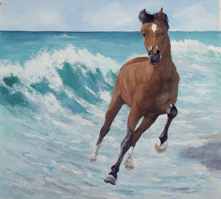
Wave Runner

Image
MERRY CHRISTMAS!!!!  Wave Runner                                                                            24"x24"                                                                            Acrylic Wishing the happiest of holidays for you and your families.  Thank you for stopping by to visit this year - it is much appreciated. This also is in memory of a wonderful artist, horse lover and photographer who lost her battle earlier this month,  Janina Suuronen.   Janina just loved horses and especially caught those in action. This is a combination of two photos from PMP by Kerri Dixon (wave) and Donna Sommers (horse).  I did the water with a new technique for me, "slop and smooth/swish" (yes that is a very technical term) and was done with a palette knife.  I really like how it came out, nice and loose and water going every direction as it does naturally in the surf.  I did this larger size as I have a frame with an ancient print of Monet's lilly po

Christmas Angel II

Image
                                      Christmas Angel II                                                9"x12"                                                Pastel Well some of this second attempt at using a grisaille as an underpainting was successful, but other parts of it wasn't.  I was attracted to this picture because I really liked the coloring.   It gave me an excellent opportunity to use lots of lavenders and fuchsias, the fuchsias rarely coming out of the box. The background is pan pastels.  This is on Art Spectrum sanded paper and as it has been a while since I worked on sanded papers I forgot how much less dust there is. Anyway, the unsuccessful part of this I think is the likeness.  I aged her and I am not sure what I did other than maybe the face is too long in mine?  I am not real happy either with the chin areas - What do you think folks.  What should I have done differently? I did find this was a difficult head position because with a child's

Christmas Angel

Image
                                                                 Christmas Angel                                                                         8"x12"                                                                         Pastel Well I think this was a successful experiment.  I put this image in extra large so you could see the texture that is on this face.  Remember I started with the 4-tone gray grisaille underpainting and then put the color on the top. Still so surprised at how clean the colors could be on top of those four shades that made up the base coat.  Many thanks to Hannah Davies for this excellent reference photo.  I just seem to have a weakness for these blue eyed, curly blonde hair types!! Since I used no finger or tortillion blending, just used other pastels of varying degrees of softness, sides and ends, you can see some of the grays showing through along with the top colors' burnished texture but still he retains the softness that is all c

Christmas Angel WIP

Image
Thought  that I would do another work in progress as I am trying out some new things and thought you might be interested in following along.  I am smart however, while trying a new technique I am back to using MiTientes paper and not trying to fight a new support feel as well. First off I have never tried to do a pastel     grisaille.  I guess I always thought that it would get muddy due to the grays underneath.  I am back to studying again and read that with pastels you already have grays involved just using any stick that isn't the pure color - if it is a tint of the pure color white has been added and if it is a shade of the original color then black has been added.  You can see that I was working with pretty light grays because this child has pretty white/reddish skin tones.  I used a red-brown for parts of the undercoat for the hair because this child is one of those curly blondes I just fall in love with.   But in some ways I am working like the old masters only thi

Yellowstone

Image
                                                                  Yellowstone                                                                     16"x12"                                                                      Pastel When I think of Yellowstone National Park I think buffalo and the geysers.  So this is a combination of photos from PMP, Ann Campbell and funky dragon.  I combined the geyser and added some buffalos into the picture so there would be some type of life - other than tourists. It also is another experiment with a new support, Pastel Premier paper from handbook paper company.  It is supposed to be "Wallis-like" as they were supposed to have supplied Wallis her paper.  Since I never tried any of it I can't be sure but it is a different type of support.  To me the surface is pretty hard.  I really don't think the pans performed as well on this as they are pretty sheer and I couldn't really get deep color so the colors in the po

The Perch

Image
I got several comments on the bird so I tried to do a little more to make him stand out just a bit more.   the top pic is revised and the lower is what I had previously.  Also shot the top pic in the sunlight so you can see more of the color.Added more darks and lightened the background around him.  since the name is the perch, I think we should be able to pick him out better. Your thoughts are appreciated.

The Perch

Image
                                                                    The Perch                                                                      16"x12"                                                                       Pastel Ok, I am giving up, throwing in the towel and going to just go with the details.  I just don't have it in me to be impressionistic and loose I guess.  Working again with the pan pastel colors that I have, but my additional ones have arrived and I will have more choices going forward!!  I am pretty amazed that the applicator does really work well and can be utilized in many positions with good result. This machinery picture is from Trevor Reeves, on FB's Photos for Artists, and the bird came from Debra Underwood at PMP.  I really like the hard abstract shapes of the machinery against the reality and softness of the bird, the diagonal, the textured background against the smooth rusted metals and the shadows. The birds in our yard con

Driving Here

Image
Driving Here 7"x11" Pastel This is a picture, from Ro Lovelock of PMP, of her grandson Will.  I have done Will previously in Wave Runner.  I really cropped this picture down so I could get him framed by the steering wheel and he ended  up in the right spot of the rule of thirds. This is my first work using the pan pastels.  I only have such a few colors but could use what I had (burnt sienna, white, black, yellow) in this picture.  They go on so sheer and working with the applicator wasn't as difficult as I thought it would be.  And they sure kick up a lot less dust.  The really beautiful thing was I applied the black steering wheel over the light face and the black didn't bleed or migrate.  So, going forward I think I'll love using the dark colors and reds as they will stay in place and behave.  Everyone has to have a vice and I found another one, and quickly ordered some more colors and can't wait until they get there. While a lot of this is