Posts

Showing posts from December, 2014

HAPPY NEW YEAR - 2015

Image
HAPPY NEW YEAR!!!!! Wow, here we are at 2015 and a whole new year to do and accomplish what we want to do.  Hope everyone has a safe, healthy and happy New Year.  Look forward to seeing you all during the next year and watching what you make happen.

How good is your imagination?

Image
  What the heck is this?  I know this is a 9"x12" Colorfix terracotta sanded paper, but can you tell me what the subject is?? Counting down to the New Year, thanks for stopping by and hope you are having the best holidays with family and friends.

Merry Christmas Everyone

Image
                                                                                                            MERRY CHRISTMAS TO YOU ALL I just love nutmen and we have our entire Christmas tree done in the Nutcracker theme.  So here is my color pencil nutman wishing you all the most joyous Christmas with your friends and family. Thanking you all for the comments, support and interest during this past year.   It certainly makes it much easier to go forward knowing that you are out there.

Mr. & Mrs. Pastel Final

Image
Mr. & Mrs. 9"x12" Pastel on Velour Paper Here is what I think is going to be the final picture of this year just because this next week looks pretty busy.  Boy, what a year for so many things, art included.  In so many ways it seems like it just flew by, but when I start to evalutate 2014 I am sure I'll feel I accomplished many things (that's another upcoming post).  But I wish it would slow down just a little.  But 2015 here we come!! Thanks again to Gary Jones who shot both of these beauties.  I combined both photos, one black and white and the other color in GIMP, gray scaled both and then found other color references of Ibis to try to get his coloration in.  Paul got some great pictures at the Washington National Zoo of their lion pride so hope to do some of their lions too. I am hoping that I am starting to get the hang of this paper and that maybe the next picture will be more cohesive as far as technique.  I find that I am changing the pastel a

Mr. & Mrs. Pastel WIP

Image
I am continuing to work on the male lion as I get the color tones laid into the lioness.  I want to be sure that I have common colors between the two of them.  I have been using a stipple brush to do some of the blending, very lightly, as it really kicks up dust, but it does help to take some of the stoke away and blend overall - trying to blend with fingers on the velour is pointless as nothing moves.  Still have quite a bit to do but like the way the lioness is coming together. Looking at this I still think I need to put the right side of the male's face more into shadows colors.  Will start to gradually do that as I don't want it all gray, but have color peeking through.  I am guessing that if I can get it to the right value and color it should help the lioness pop out as being forward of the male.  Had to take a bit of a break this week to do tablecloths and napkins for next week.  Sewing is kind of artistic??   Anyway, while not something intricate it still took a go

Mr.&Mrs. Pastel WIP

Image
    Here is an update on my lion friends and I am really not sure I am happy with the way this piece is going.  I am on the second try on this velour paper and I must admit it is very strange and I am not sure yet that I really like it.  (I really miss being able to blend, I guess it covers a lot of errors)  In my reading a lot of people have switched from velour to pastelboard.  However I thought that pastelboard is more like sanded paper, but I may be incorrect.  I keep losing my underdrawing and then the colors look fine one second and then they go dead, just like the paper swallowed it.  Also this support creates quite a bit of dust so I have gone to my using air purifier and a mask.  I am using the color of the paper as some of the color of the lion and maybe I would have a different experience using more of a complementary color.  The good thing about putting a shot on the computer screen is being able to see major errors, for me it brings some objectivity. Goal now is t

Mr.&Mrs. Pastel WIP

Image
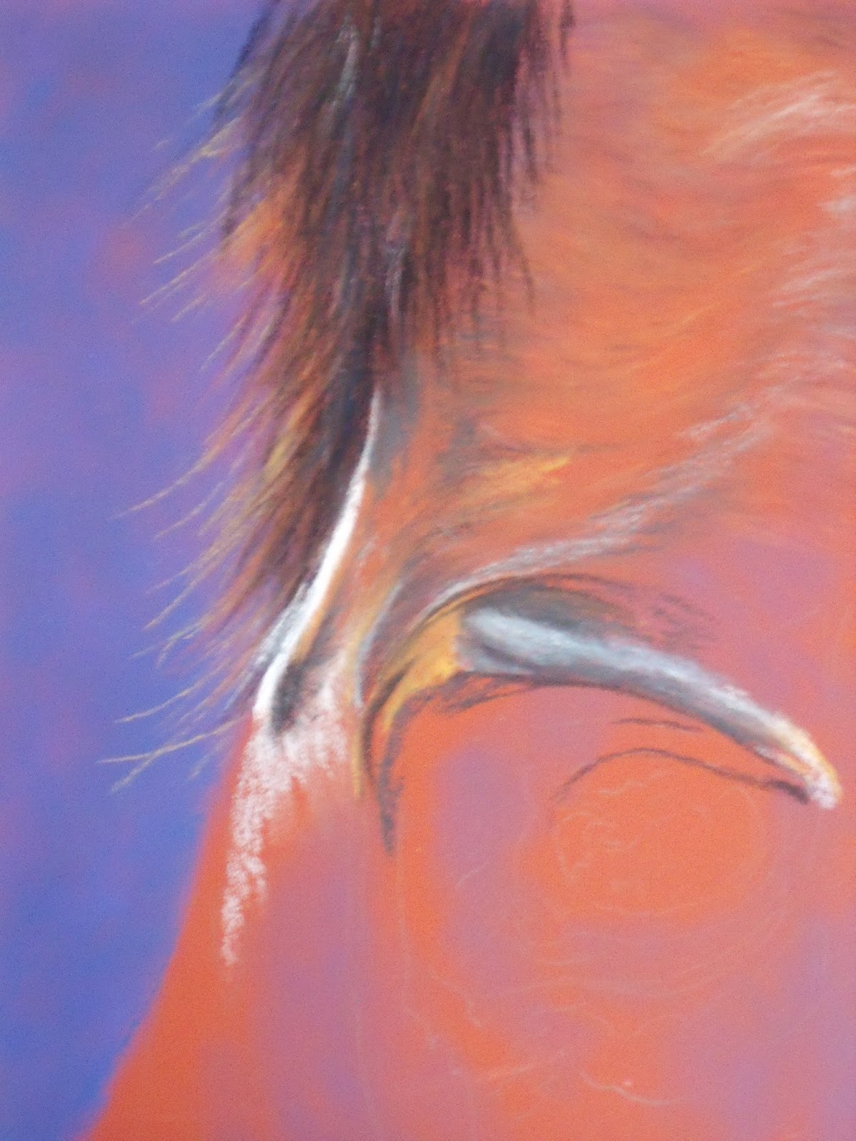
      Ok, this is the start of Mr. & Mrs., my double lion portrait, on golden yellow velour paper, 9"x12".  This is a combination of two photos from Gary Jones at PMP.  The male was in black and white and female in full color, so I am working the male from value studies I did plus using other lion reference photos to try to get his colors correct.  Colors will be the same for both so hoping to keep it cohesive. I can already see that this is going to photo differently than what it is in real life as the photo background looks blue and it actually is a blue green.  I will try to take the next pics outside so it might translate better.  But, heck it's cold. I mounted this velour paper to the same size of acid free foam board, I didn't have the adhesive sheet, so used 3M Super 77, liberally spraying both the board and the back of the velour sheet.  It seems to have bonded pretty good.  I let it dry overnight so it was good and setup before I started app

Watching Finished Tweaks

Image
 Watching   Ok, here is the tigress with her final tweaks where I changed some of the color zones - hoping you can't really tell the differences.  Don't think I am going to do anything else to her but put her in a frame.  Let's talk about this unique way of framing pastels....... Am going to try to frame as Leslie Harrison suggests.  One thing she does I didn't know to do initially was put this piece of velour on foam board before you start painting - next one definitely as velour paper is rather thin and could wrinkle.  Anyway you put velour on board or acid free foam board using a sheet of double-sided adhesive.  Paint away - Then she thoroughly cleans the glass and puts the picture right against the glass (usually in pastel you use the mat space to act as a dust catcher) and then puts in her brads to the frame to make it snug.  She says you get a little dust but she doesn't have any issues.  Hoping for no issues as this isn't going to be snug on the bo

Watching - Tiger, Finished

Image
Watching  9"x12" Pastel on Velour Well I think that "Watching" is pretty much complete.  As usual I am going to let him sit on the board and rest a couple of days and then I can do tweaks to him.  I think I see a few of the markings that I'd like to change, especially that longer tough hair just around the neck area.   But want to get some distance first, too many hours in this to try to radically change and ruin the piece.  Know that I need to keep going over the whiskers to get them whiter and with more substance.   I will admit that I tried whiskers with pastel and couldn't get the lines thin enough, so ended up using the trusty Sakura white gel pen and keep going over them as the velour sucks it up.  All the experts say sharpen the pastels - well I just don't know who to get it that sharp!! Why is it with pictures you like some parts and hate others?  Do you think anybody gets it all where they like it? As always happens when I get done wi

Watching - Tiger More WIP

Image
Well continuing to work on this tiger.  Even though velour seems to take color pretty fast I find I am working lots of hours without looking like I am making progress.   I find that I keep adding additional layers to what I have already worked, still trying to get that individual hair look.  Think I may have been lucky and able to mask my error at the top of the head, thank goodness each tiger has different random markings. I had to freshen up the left eye as well, and you can really tell the difference between the two eyes.  It seems that even though I am trying not to lay anything or put hands on areas that have been worked, the color I guess gets imbedded into the velvety paper, dulls and needs to be touched up a bit.  Today's time has been spent trying to get the muzzle to come forward away from the flat plane of the face.  I also have to get some more references on what the nose looks like as I am not happy with this, it matches my reference, but doesn't look finishe

Watching - Tiger WIP & Question Need Help

Image
Ahhh, boy does it feel a lot better doing something more inside my comfort zone.  Just couldn't make myself deal with green today (ok there is a little I did on this, but not like the landscapes).  Decided even with the velour I was going back to work on Watching.  Saw a documentary last night on lions with some previews of a tiger show to come and got excited. Speaking of the velour, I think I quite like that surface a whole lot better than the sanded paper.  I am going to try several other brands and the pastel mat as well to see if I can find a surface that feels smoother.  I got more Colorfix sheets to have to use up, so there will be more pics on it and maybe by the end I'll know what to do with it.  Fingers crossed. Today was sketching in definitions, where the black and white zones should be to form the cheek and muzzle areas.  Still playing with underpainting on the beige zones - I am still undecided on what the color and order lay down should be for those areas. 

30 BRP #3 - Looking Glass Falls

Image
Ok, so I know I am cheating a little bit, this is Looking Glass Falls and I know it's on Rt 276 and not the Blue Ridge Parkway, but it is just down the mountain.   It is such a beautiful falls, well visited because it is just right off the road, no hiking is required.  Even season shows more tree growth and a different amount of water coming over the falls.  Imagine, this water cascades 24 hours a day 7 days a week. I have wanted to do this falls for many years, but was chicken and intimidated, but decided today - what the heck.  This is still on sanded Colorfix dark gray paper and it still seems grainy to me.   I am going to try some of the Bristol baord I can make using clear gesso as it might be a little finer. I still am struggling with how to get the effect I would like with this paper.  I do however like how it gives the speckled look for the water going over the rocks.  I can see I still have lots to learn about making leaves.  Guess I better pull out my landscape book

30 BRP Paintings #2 - Looking Glass Rock

Image
      Well Folks you are going to see the bad and the ugly.  This is the fourth shot of this second landscape of the series, the frontal side of Looking Glass Rock and it is taken from the Blue Ridge Parkway around Mile 418.  I keep reworking it because I am not happy with it, but I have to stop now.    I think one of the things that isn't working for me is getting the values in the right place.  John F. Carlson says to make a landscape work you need values to: 1)  1st value is the lightest value which is the sky (because I have such a stormy mood in this this doesn't hold true for the entire sky 2)   2nd lightest value is the land or ground plane, which directly reflects the light of the sky - think I got this with the last mountain ridge 3)  3rd value which is darker than the first two values is the slanted planes, mountains, slanted rocks, hills, etc get less light 4)  4th value, which is the darkest should go on upright planes, trees, buildings and othe