Posts

Showing posts from April, 2014

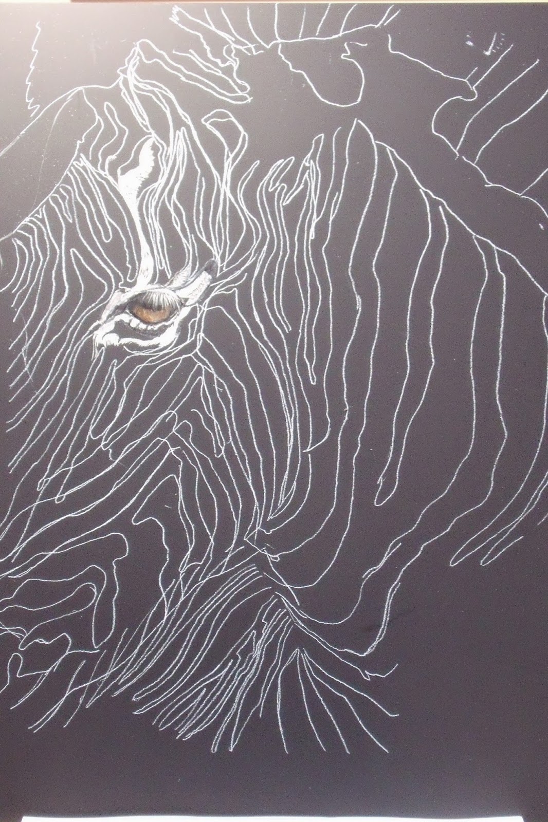
Zebra Scratchboard Update

Image
Here is today's update on my Zebra scratchboard. Just want to clarify what you are looking at is the ear - hey just in case - which is laying back and beginnings of the mane on the top of the head.  I am trying to figure out scanning as I think it will do a better job of showing the strokes.  Since I am working on an 11"x4" board my scanner can't take the entire picture, gets most of it, but ... I know some folks talk about taking multiple scans and then stitching the image together.  Anyone have any idea on how you might do that?  I will check YouTube videos for GIMP but it sounds intimidating to someone of the limited computer/photo program skills.  Oh, well, live and learn - necessity is the mother of invention, right?  If I figure it out will post. Ok, pulled out a couple of new tools here, some little wire brush, that kind of is a blender and am using it as a cross hatcher for try to finish the long white stripe work, and then a fiberglass brush that takes of

Zebra Scratchboard

Image
  Well off on a new scratchboard adventure, going to do Gary Jones photo from Paint my Photo, if you went to the original photo at h ttp://paintmyphoto.ning.com/photo/zebra-close-up you would see that I flipped the image - don't know why, just thought I liked it better that way and it wouldn't look like everyone else who has done a pic from this photo.  Also I am right-handed and I think that this would benefit the natural rhythm of the strokes on the scratchboard.  I went absolutely cross eyed when I drew this out and am already finding that I am changing up the stripes as I am working them.  Just trying to focus on one spot and work out.  Think too this is going to take a lot of freelance drawing as I definitely lost form when I transfered from original drawing to the board.  You can see too that I looked up another reference photo of the eye so that I could put some life and color into it, also added the eye lashes - my artistic liberty I guess.  I love to sta

Golden Gingo - Mixing Complements

Image
Been a really busy week, so not much to show, at least on paper, but got lots of ideas bubbling in the old brain.  Spring has sprung here and so has the yard work!!!  So a physical and cerebral week if not putting something on paper.  Latest experiment is to try gold leaf.  Lived all these years and never have done any of it and have a few ideas of how I would like to incorporate it into pictures.  I got a liquid that I thought would  be easier to add into small portions of a painting rather than the paper you have to glue in place.  Worked on this little ACEO, and am going to give the gingos a try again using different colors and maybe color pencil.  Thought I'd have a couple of ACEOs done for this post, but had to cut grass today as we got rain coming now for 4-5 days - so later this week will post the second effort.          Tips for Using Compliments in an Underpainting Use a color wheel to find the compliments if needed. Complimentary colors are colors that

Fairy Wings - April PMP Challenge

Image
Fairy Wings is 5"x7" color pencil and ink on white paper.  The April challenge for Paint My Photo was about using the photo reference library, primarily looking for butterflies.  If you get a chance check out the April 14 gallery and you will see some absolutely super work.  Plus the references, there truly is something for everyone.  When I started this challenge last month I started to do things that were outside my box, something creative.  One of the benefits of PMP is they do a magazine and Lorna Webber has done several articles on how artists have combined several reference photos and the unique results that they get.  So that's my goal with these challenges - DO SOMETHING DIFFERENT - last month did Alter Ego.  This month it's a fairy with butterfly wings - not quite as dramatic.   While I did fail on the first attempt, blew the face/arm configuration on the fairy's right side so that it wasn't correctable, I had to retry again.  While not terribly hig

Curiousity & The Cat

Image
Well here is my first white scratchboard completed.  At least I think it is until I get some feedback from the scratchboard forum artist folks at WetCanvas.  I found this very different to work on compared to the black board.   More difficult maybe to put the color on first, and scratch to white, rather than scratch through black to white and then color.  Not sure what the psychology is there but it is what my mind says. Finally figured out, and will apply next time, that I need to lightly sand/rough up the board at the beginning so the first base pencil colors apply and adhere better.  He is kind of a scruffy looking guy, I think  he is young, seems to me most Cheetahs are sleeker looking.  ESP at Paint My Photo, the photographer, said he was surprised as this cat was coming right to him and he didn't have the lens that he wanted to use - hence the title Curiousity & the Cat.  Now that I look at him, this pose is pretty similar to the Tiger I did a year or so ago, whe

Scratchboard Cheetah Update - NEED YOUR COMMENTS PLS

Image
Here is an update on this white scratchboard Cheetah.  I am figuring it out slowly the whats and the hows and have since found out that I should have lightly sanded the board before applying color pencil, as the board is slick and smooth to start with.  Duh!!   So that is part of the reason I came up with such light color on the initial layering I guess.  Anyway, you can see on the right side where I am going, just getting in some of the final colorations and have done more extensive scratching.   Still a ways to go.  Seems to me that working on the white is more difficult and time consuming, but allows for more creativity since you actually put the color on.   Got to say though I am getting anxious and am going to get the Zebra on the board so I can start to dabble on that while I finish up this guy.                                                        NEED YOUR COMMENTS: For the last month or so I have added gems to a lot of my posts.   I have found and noted them for myself to

Curiousity & the Cat - Scratchboard - New Work Space SetUp

Image
This is a shot of a young Cheetah by ESP of the UK from Paint My Photo, I have had it printed out for a while and wanted to give it a try (but of course I can't find it, drat).  I am doing a couple of different things here on this project and I might say it is taxing me!!  Only thing I am really liking so far and kind of done with are the eyes. 1)  I am doing my first piece on white scratchboard.  Here I have put down colored pencil and it was just too light, so now am going back and adding color in with watercolor pencil, so that I have some color to scratch down to the white and reflect against.  Think I need to put in several more layers, then do a first scratch and layer again, repeating the process until I can get the fur look I want.  Not sure yet what the heck to do with the background as I have little splats from my pencil that will need to be covered.  Right now I am liking the black board better - but persevere. 2)  I usually work from a printed sheet of a photo

Dancers - More Color Mixing Tips

Image
Don't you just love when you are organizing (sounds good doesn't it), well actually I was just getting out my last sheet of Bristol paper and found this graphite drawing I did from 2002.  I remembered it immediately, like meeting an old friend, and today I am just as taken with the action and grace of these ballerinas and the implication of movement is what draws me to this image.  Guess as a kid I always wanted to dance but lacked one thing, coordination.  But still appreciate those who can and do this art.  Will have to see if I can locate the reference photo and would love to try this again, probably in pastel.  But for now, this will have to go into my archival drawing box to be found and looked at again another day.                                                   MORE PAINT MIXING REMINDERS 1)  Get to know the properties of different whites. Every tube has it's own characteristics and affects colors. Titanium is opaque and bluish Zinc white is

Boston Terrier Scratchboard Update

Image
Think this will pretty much complete the Boston Terrier scratchboard.  Unsure of whether I need to do something on the viewer's left side to give more definition to the black area of the head.  In a regular picture we'd have a color background to accentuate this.  This is the 5x7 sized board which went a lot faster and I learned that it never really gets down to white, there are different shades of white.  For the coloring this time I used watercolor pencils.  Wetting the lead with the brush and then applied watercolor liquid with the brush.  I also tried very hard not to mark up the background surface.   If, after looking at it for a few days, I'm satisfied, I will apply a Krylon sealer which is supposed to take all marks and neutralize them.  If sealed, they say you don't have to cover with glass but can display like an oil painting.  Still haven't tried the real Ampersand inks yet, but not sure I can get the color range, and dilute them enough to get the hints

Boston Terrier - Scratchboard WIP

Image
I had another picture of a Zebra by Gary Jones all worked up for an 11x14 board, got crossed eyed with the stripes and wimped out.  I was able to stop at the art store (oh my gosh - Binders - and it is wonderful, but could be addictive) and get some smaller boards.  So got both black and white 5"x7" 3pk boards so I could experiment without ruining a $7 board.  This little Boston Terrier was Izabella's best friend, I don't know the name, but loved the look.  So this is a bit different than the Eagle as it has a lot more large pure white areas and somehow I have to define the black areas and keep them looking black (like on the ears).  I really like the look of adding the color to these boards so will eventually add the pinks and gray tones too.  Got to get brave enough now to do the eyes and definitely you know I like color eyes against black and white. I do want to post this up in B&W on the scratchboard forum on WetCanvas though to see if I can get s

Constatine - From Life

Image
  Well the drawing from life saga continues.  Here is Constatine, from yesterday's life drawing session.   So much to choose from and focus on when you are at the blank easel just looking at a person and a blank piece of paper.  I changed up this time and added color working with pastel, definitely changes things.  While my photo reflects the yellow light, at every break I was saying, "I'm going to add more red".  He is Greek and had a swarthy complexion.  This definitely took me the full 3 hours, and I only hastily added in his shirt. I see too, with photos side-by-side, that his head is tilted a bit, I didn't catch that.  If I darkened the under chin/neck area and emphasized the angle toward the ear that might actually help get this piece looking closer - but I think the actual distance from mouth to ear along the jaw line is too narrow, so not going to mess with it but chalk it up to an experience. I realize that next time I am going to have to concentrat

Mary Janes

Image
I am sure that many of you have not heard of Buster Brown shoes or Mary Janes.  But in the 50s and 60s this was a big brand and every little girl had or wanted a pair of Mary Janes.  Leslie Saeta did some kids shoes in the January 30 paintings in 30 days challenge in January.  These are my rendition and I thought these would make a cute shower gift.  I still have several more that I want to do, but am trying to figure out the size. My dilema is this, I started out at 5"x 5", see above, but found it difficult to come up with frames.  Then I found the cute wooden frames, at my price $4.97 (yes I am cheap) at Walmart, lightweight wood that I painted my way, and had to go down to an image size of 3"x3".  Someone else had the opinion they should be 8"x10", but that is almost larger than life.  So what is the right size for these "pint size pics"?  Or anyone have some great ideas on where you can find reasonable frames in lots of sizes? 

Golden Eagle Update - Color Receipes

Image
I toned down the right eye on the left pic and I think that is an improvement - this is meant to be one side in light and one going into shadow.  Does it need more toning down?  Also should I put some more semblance of feather work into the shadow side so it doesn't look like such a distinct line of stopping?                                                         COLOR RECIPES For - Mix - Why Bright green – Lemon Yellow w/ Phthalo Blue – neither have a trace of red Dull Green – Lemon Yellow w Ultramarine Blue - Ultramarine has purplish cast due to traces of red so red dulls green Duller Green – Cad Yellow Med with Ultramarine Blue – has traces of red in it Dullest Green – Cad Yellow Deep w/Ultramarine Blue – large amount of red in these colors Bright Orange - Cad Red/Grumbacher Red w/ Cad Yellow Lt Dull Orange – Cad Yellow Med and Permanent Rose or Quinacridone Red – red needs to have a trace of blue in it Duller Orange – Cad Yellow Deep and Q

Golden Eagle - Scratchboard

Image
Golden Eagle 11"x14" Scratchboard Ok, caught myself babying this along, so closed out my left brain, and just went for it this morning.  See, I still catch myself slipping back into bad habits, and that was something hard fought for that I gained from January's 30 in 30 painting challenge; the ability to work faster and go with the flow.  Now I reverted back to plodding because I was unsure and scared to make a mess of this.  This really shouldn't have taken this long as scratchboard can be bold and corrected without fear.  Not sure I like the right eye in shadow, so might still go after that and tone it down a bit, not so black.  But overall I a happy with this first experiment.  Scratchboard gives control, ease of correction and can get details, and you know how I love details.  Anyway, washed the entire background again with black India Ink to get rid of the marks and it does show streaks and bubbles when applied with the brush, so there has to be a bette