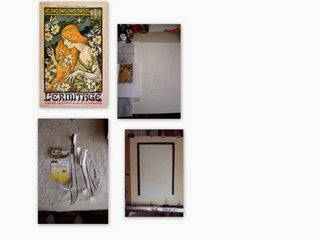
Posts

Showing posts from March, 2014

Golden Eagle Update

Image
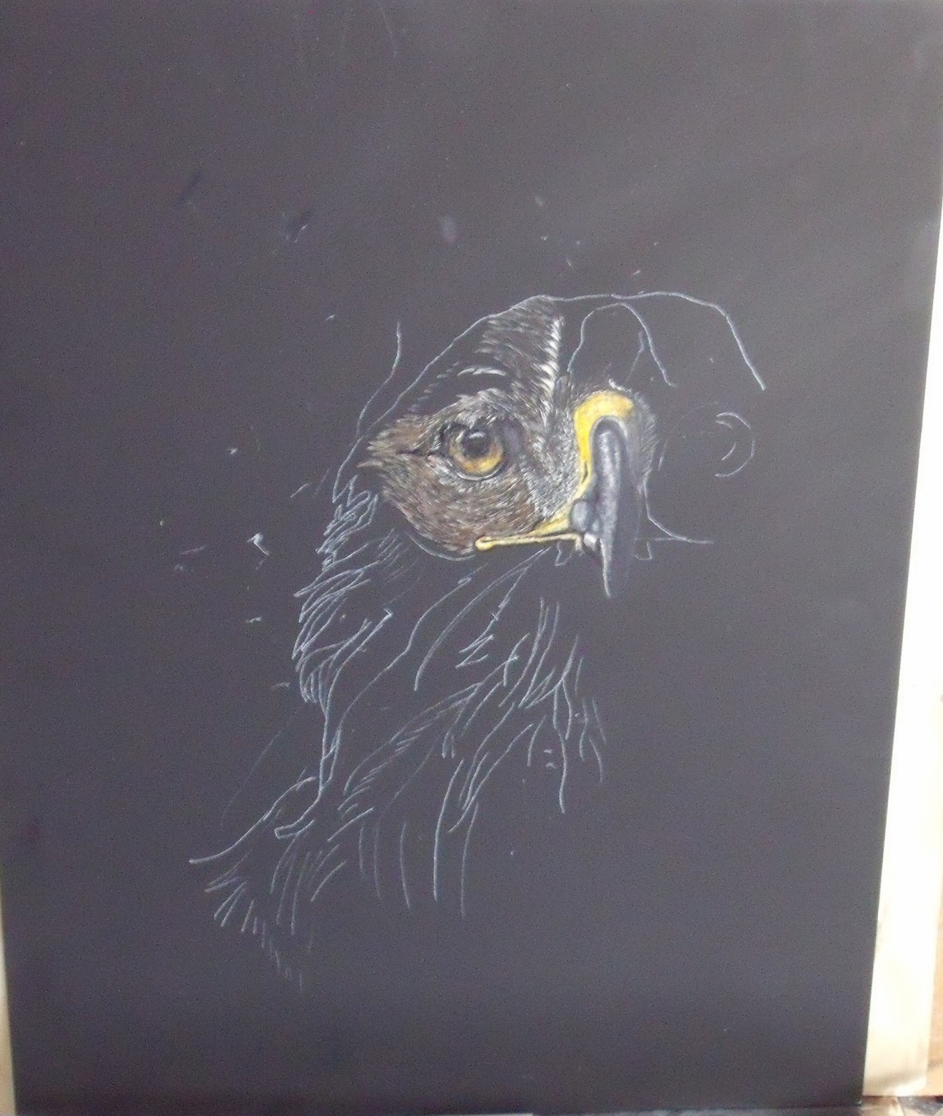
The scratching continues.  I have switched to using Bombay India Ink brown for the feather work, adding in some marker color, but find that the markers get too gummy.  The clayboard doesn't absorb the marker ink as well, it sits on top and then if you add another layer it moves what is already down.  Have added some water to the ink and find that it changes the color somewhat from brown to gray, so went back and am going to have to dilute it much less.  I guess I still need to get the Ampersand inks out and give them a try before I get this piece finished.  Also finding that the ink on top of the black India ink creates a glaze that causes a glare when light hits it, so have to be real precise in how to photo and when you look at it, don't know if when I frame (do you frame these?) if that would help the glare issue.  Also am going to get some black India ink, hoping tomorrow, and plan to go over the background once finished to see if I can get rid of the nicks and scratches

Golden Eagle - Paint with Depth

Image
Well this is the beginning of my scratchboard experiment.  And wow, do I see that the board ever picks up plenty of marks, am going to have to figure out that part of things as it needs to be black for this picture.  I am using the acetate cover sheet to keep my hand off of it, but when I wipe with the sock I get streaks.  I finally got the eagle's proportions right, drew two pictures on Sunday,and boy even though I wanted to draw large, but it was way toooooo large - no, don't need a 2" eye staring right at you.  Next step was to watch 13 ten-minute videos, from WetCanvas library, they also have a group dedicated to scratchboard art, on how various artists approached scratchboard.  Then, no more excuses, even though I don't have a clue I am doing I am on to the scratching.  Then because I am impatient I am coloring in as well.   I am using Prismacolor marker ink instead of mixing the Ampersand inks, they say you can also use color pencil to knock back the white of

Scratchboard Tests & Atmospheric Color

Image
Ok, I will admit it, I feel like I really don't know anything about art these days, the more you see, read and do, the less you feel like you have control over.  There are just so many things to try while you try to define what you are and want to say.  You either try them, or you don't and then wonder.  So I feel like a newbie here.  Many of you have probably done scratch art over the years.  There are some folks that are doing some beautiful things with the medium.  It is not just black and white any more, but color can be added with inks, markers and color pencil.  I kind of think this is just an extension of my fascination with pen/ink drawing work.  So I thought I'd dabble a bit.  I have a large board, but wanted to practice on something smaller - well so few people do this medium, the art store that is closest doesn't carry anything other than kiddie paper kits as it didn't sell, so only way to get something smaller is to mail order and then wait.  Rememb

Curves & Importance of Planning

Image
Yes I still am intrigued with the graphic look of silhouettes.  Each year thousands of motorcyclists comes to the Blue Ridge Parkway to drive the switchbacks.  So this was a combination of using one of the switchback curve signs along with a iconic image of a motorcyclist.  Can you tell what is wrong with this picture?   I think the cyclist should be more leaned to the viewer's right, but when I put the drawing down I centered the circular curve and missed getting the lean which would have provided more action.   Planning is something that I am working on, and it just takes a few seconds to make a bad decision that if not immediately caught comes through the entire painting process.   So this will have to be done again to see if I can make a more dynamic                                                                        PLANNING              Here are some simple questions that if you take a few minutes to pre-plan and write it down to reinforce and have handy for review, i

L'Ermitage est fini & Greens in daylight

Image
L'Ermitage Poster 18"x24" Acrylic on paper Got it finished and not a moment too soon, tomorrow is the day when hubby gets a surprise.  He has seen it in progress and liked it so hoping I won't get a surprise.  Am happy with it, was harder than I originally thought with all of the cutting in.  I think I touched up and repainted the borders several times before I thought they were as straight as I could get them.  Stayed true to the limited palette and didn't have a problem finding a color mix using those colors for anything that I wanted.  In real life I really like the dress as I used a double loaded brush, dab method, and got a lot of texture in the green,  it is a light green with yellow, not a solid lime green.  My other goal of making notes?   Well I did so-so on that one.  At times wished I would have done better because if I had to go back to make a mix, it certainly made it easier.  So something I will try to work on as I got forward.  I definitely n

Poster Update & What Color is Daylight by the hour??

Image
    The limited color palette experiment continues, here is a quick update on my poster, latest adds is getting the skin tones in and trying to get the shadow variances with bluer skin tones.  I have to say that I have been pretty true to the original palette with the exception of adding the Black and Burnt Sienna, all colors have been mixed from my six hues.  My main workhorses have been Cad Yellow Med, Grumbacher Red and Ultramarine Blue.  Seems like I do a lot of patting in and glazing with this acrylic to try to get the blended coloration in.  Nancy Goldman (be sure to checkout Nancy's blog, not only wonderful coastal pictures but she works on a unique paper, terraskin,   http://nancygoldmanart.blogspot.com ) suggested using a retarder so there is longer drying time, will have to get and try it.  Hubby saw this the other day, (talk about taking the horse to water and making him drink) but gave it the thumbs up and liked it!!!! Eureka, got to get this done as the date

Alter Ego - a Challenge

Image
Ok I admit that my thought process is getting a little weird, (I prefer to think of me going avant guarde) and as someone in this house says, and he shall remain nameless, no one is going to get this, how would anyone get this and why would you paint such a thing???  Paint My Photo, check it out at http://paintmyphoto.ning.com/ , has several monthly challenges, in different media.  For March, the color challenge was to select a B&W photo and paint it in wild, bold colorful colors - think Spring.  I saw this classy lady's photo from Alex Lee Johnson,   http://paintmyphoto.ning.com/photo/classic-ashleigh , and immediately thought of going Andy Warhol, (doing it all in graphite but the eyes and lips) but someone beat me to the Andy Warhol look before I even had my first cup of tea.  I also wanted to try some of the unusual colors that I have seen one of my favorite pastel artists, Harley Brown, use in his paintings - he always says that if you have the right values, any color w

L'Hermitage Poster Update

Image
Here is an update on my poster.  Kind of feels like I am doing a paint-by-number a bit as this is really sectioned and there are lots of hard edges due to the graphic look, I guess.    Am doing block ins first to eliminate the white of the paper (you can see that on the bottom of the hair) and then final layers for color adjustment.  I took a few liberties with the hair and made some more definition  in the wave layers than what is on the poster, not sure about it, if it is too busy, will finish and might go back and flatten it out to keep the same effect as the original.  I am still struggling though to get acylic to look and blend softly, haven't learned that trick yet - so if you know the secret, please share . But, boy, what a difference red/orange makes huh?  Like the way it pops off the blue-violet and blue- green in the background.  Am taking a bit of a break here and working on something else that is kind of fun and then will come back here to start putting in the finis

L'Hermitage Poster - What's on your pallette - Please let me know

Image
  One of the intentions of doing this picture was to work on color mixing and use a limited palette working on values, gray tones, contrasts, using complements and warm shades against cool ones.   But first of all, isn't it just fun and full of anticipation as a picture develops, how it takes on a life of it's own.  The way this is coming together is to paint shapes because of so much cutting in and angularity of the design. I think it is a good thing to do, draw/paint in shapes, and then when you step back it is a pleasant surprise to fine an image is indeed coming out.  Kind of like magic.   OK, back to colors .... IF YOU STOP BY FOR A LOOK, CAN YOU LEAVE ME A LIST OF THE COLORS THAT YOU USE ON YOUR PALETTE?    I WOULD LIKE TO SEE OTHER IDEAS OR DETERMINE COMMON COLORS EVERYONE IS USING.  No, I won't ask to see your color charts.   As I mentioned I am studying a book, Color Harmony by Margaret Kessler.  I have it for 3 more weeks, from the library, but

Monk 7 - L'Hermitage Poster Update

Image
  Monk #7 is now done, whew I found one more monk than I thought I had done - 7 in all yahoo!!!  Did most of this one with a new pen, Zebra's Sarasa Gel with rapid dry ink.  It is a .7mm which lays down much larger and bolder lines than what I normally use, but eat up the white space quickly.  However, it performed really well, no clumping, blotting or smearing and was really smooth going on the paper.  This size will be beneficial when I do a much larger pen/ink drawing as a larger size can take the bolder lines.  This monk was a study in trying to make negative shapes and there is less outlining.  I have been tracing the pattern over and over on tracing paper and think I have worn the original one out, proportions are out of whack so time to do a new drawing for the next five or six. The next picture series is an update on the poster I am working on.  My hat is off to Monsieur Paul Berthon as he not only painted this but designed it, while I am struggling to paint it.  Th

L'Hermitage Collage

Image
Realized that I haven't posted a work in progress since I did the January Challenge, so thought this experiment with a limited palette might be one to do.  My hubby has been wanting a vintage poster that he could put in his space for quite some time, so thought now might be the time.  Had cut this out of a magazine quite some time ago and loved the color of her hair, as that really is the dominant color and focus of the poster.  This was originally done in 1897 bt the Frenchman Paul Berthon.  Thought it looked relatively easy - well, wrong - the @#$@ thing took me 2 days to get drawn down on the paper as the graphic look is a mix of curves and angles.  Also reference was quite a bit smaller than actual drawing so took me some time to get the proportions and placements right.  Guess I am glad I missed some things by not going to art school!! Also wanted to show the low tack artist tape that I used as a mask to try to get the straight border lines as I knew there was no way I was

Color Wheel - sort of

Image
Well here is a finished color mixing wheel that I have worked on - finally starting to get more formal in my art education (about time).  Anyway this is using a limited number of colors that I actually own (didn't want to go and buy something new) and getting the tints, shadows and grays.  I started by using the palette recommendation of Margaret Kessler for Munsell base and also edited a bit by Stapleton Kearnes.  There are sections where there are no specific colors mentioned on my Munsell reference wheel so I guessed at the complement and it seemed to work.  Overall it was a good exercise and I am really pleased that the colors turned out so fresh and clear - no mud - which was the point.  I now have a plan check colors in use prior to putting on the canvas. So now the next phase is to begin to put it in use and I have an idea of painting something for Paul as the first trial piece.  It seems odd not to have some colors I usually use on the palette, yellow ochre and burnt sien