Posts

Showing posts from August, 2014

Courageous WIP

Image
Ok, so some times I get a littleout there on the edge so I am asking for some feedback.  I have been asked to donate a picture for an auction for Ronald McDonald House Charities.  They are famous for assisting families in many ways and most major hospitals have houses or family rooms for families to stay during their chid's illness. I have been wanting to do this little girl's picture for a while now and thought I would use it, but eliminate her hair since so many of the sick children that this charity reaches are cancer patients.  I don't want this to be sad, but portray her as a fighter who is beating the disease.  She shows attitude with the character of the hat, again something that is very common for the cancer patients.  Here is the question, is this tacky?  Should I go ahead and just do the as reference shows with hair?  Either way I think the picture has potential.  I guess my mood is such right now that I am not sure that what I was originally thinking would b

Beauty Finished

Image
Ok, I am calling her done.  I am pretty happy with this scan versus a digital photo as I think it better shows the softness of the color, strokes and smoothness of her skin.  I am going to have to learn that stitching program so that I can just switch to scans even with pictures larger than my scanner deck.  As you can see I still am struggling with the darker spots and hope to get some feedback from the community at The Five Pencil Method on how you can go dark with the softer leads but still retain smoothness. Again, I really like how this turned out and still have a long way to go before I am really comfortable with this new method of the disappearing stroke that Darrel advocates.  But I am pretty pleased with the first try, only thing I really don't like is that back shoulder, but again am hoping that I will get some suggestions.  Might be as simple as not going that dark in the future.  I also really like just the subtle color tones like a tint.  I think I did ok on the ha

Beauty WIP

Image
     Well already it is getting late on Sunday afternoon so thought I better post the update.  Since I am in the middle of a family crisis it has been a blessing to have something to work on while I stay close to the phone.  Am happy that I got the background in, no matter though what I do I can't seem to get it even, more studying on that for the next time.  Also got the foremost shoulder in as well, might still need to tweak the darks shadows a bit darker to give more enhanced form. Needed to play with the picture a bit to try to get it closer to real life, but still the subtle color doesn't really come through, might try scanning this once to see if that will improve picking up the gradiations and color parts. I still have the dreaded hair and not sure if I will start that this afternoon or not.  I am always glad to post these as I immediately see little tweaks that I want to make and so was able to do those while fresh in my mind.  Hoping that there will only be

Beauty WIP

Image
Ok, here is the update on my progress. I still need to learn how and more practice working in the shadows to keep it smooth just like when you use the harder pencils.  The softer graphite throws out spikes of graphite and give you little dots and the impurities in the paper pop right out.  I guess I could eliminate all of that if I would just use charcoal the next time.  Plus other advantage to charcoal is I won't get the graphite shine. As you can see I decided to add in a darker background and am in process of adding the dark graphite - I have several more layers to add and then I will pull it out using a paint brush - I did that on the shadow behind her head, burnished it and that tends to take out all the white spots. I also was hoping that if I brushed it out then I wouldn't get a big deal graphite shine. I also added color to her face but it really isn't showing up so much, so might change up the color to a more orange yellow and see if I can get a little bit more

Beauty WIP - She Needs A Name - Help Please

Image
Here is today's update on Beauty.  I can't think of another good name for her - so, if someone has an idea please let me know.  I am slowly working my way through the face concentrating now on the right side which is mostly shadows and will be darker in spots.  Again the secret to this process is to put light layers and then work the softer pencil layers back into the previous layers by using your harder leads, just like a blender.  I have also added some color to her hair and cheek tones, again though, it is very subtle.  Next think I will work on is the shoulder and back leaving the hair to the right side of the face for last as I believe that will be the most intensive and difficult part for me.  Somehow that hair has to be one long sweeping stroke to look right.  Also it isn't too early to start to worry if I am going to need a background.  In the reference piece it is a solid black.  Talk about strange things as I wrote this sentence I glanced around at the referen

Beauty

Image
Beauty 11"x14" Graphite/Color Pencil Well the experiments by trial and error continue and there are a lot of things going on in this experiment.  I am trying to work with the applying graphite in a highly realistic manner using the 5 Pencil Method as outlined by Darrel Tank. By the way I recommend you check out his site thefivepencilmethod.com.  Tons of information on there via videos that are also posted on YouTube.  It feels like taking a workshop as he does a lot of critiques and takes drawings from one level to another while he teaches what to look for and how to think as an artist.  Just excellent!! I also wanted to use a photo that I had gotten from PMP quite a while ago, although I didn't get the link and just looked and didn't come up with the image.  It called to me because it looks like B&W with just tints of color.   Made me think of old time photos that were tinted, think it was back in the 30's and 40's, predated color photos.  Trying to

Bulwagi........Ears Completed

Image
Got Bulwagi completed, I think, today.  This has been such a fun experiment and I am happy to say such a forgiving process.  Dab on a little more pastel, graphite, erase it off and voila you have a bit of texture of elephant hide.  How? 1)  Good reference photos, thanks Paul/hubby 2)  textured mat board 3)  pastel 4)  graphite 5)  putty eraser (almost the best tool in the box) My hubby is glad to see that he isn't all purple/blue and yellow any more, although the undertones of terra cotta, purple/blue and ochre still shine through and are repeatedin the background. I am not going to spray fix this as I don't usually fix pastel as it tends to change the colors and mat down the refracting particles (sounded pretty good eh?)  So will end up and mat and frame if I frame him. Will leave this on the board for a few days so he can talk to me and make adjustments as needed, I see a big one I just fixed by his belly.  Will definitely try this technique to experiment again wit

Bulwagi WIP Update

Image
Hmm, kind of making this up as I go along.  Here is today's update and think that I have about 1/3 left to work over, primarily the right side.  But since it is getting a bit tedious I am going to go have a run and then thinking about starting something else to work on as well.  I keep putting on some graphite dust but it just isn't showing up.  I might try wetting my finger and then smearing it a bit to see if I can get it to show up as a bit more texture, maybe I need a light spray of workable fixative, but it is so humid I am afraid it will ruin what I have.  So.... dilemna.  Don't know if it is the that the board is getting full and not holding additional specks but I get in on and then it just disappears. Always glad to see this on screen because you see things you don't when you look at the picture, also need to put it in a mirror so things pop out there as well. Anything anyone sees, please let me know. Thanks for stopping by and hope you are having a good

Bulwagi WIP

Image
We got more rain so the weather here is a bit cooler and it's time to go out and enjoy the porch (alas too early for wine) and my hubby.  So this is probably it for the day unless I sneak a few minutes here and there. Ok, got a couple more hours in on this and wanted to post this update because I think it shows a little bit better the direction I am trying to take this piece.  Here is what I am thinking out loud on this post.  I am trying to get more definition with the pencils and you can see if you enlarge this pic the more detailed work that is going on all around the head area.  I also have put on some graphite powder to add texture and see am going to have to apply it heavier, which I think I will do the final coat at the end.  Always have to be bolder than you initially think for both darks and highlights.  I see here that some of the highlighted areas need to be smoothed out, but will wait until the end, unless it bugs me.  Actually will probably add back in more dabs of

Bulwagi......Ears

Image
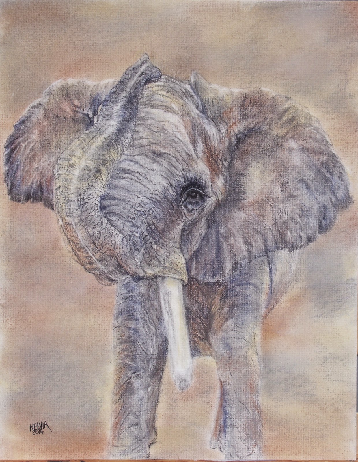
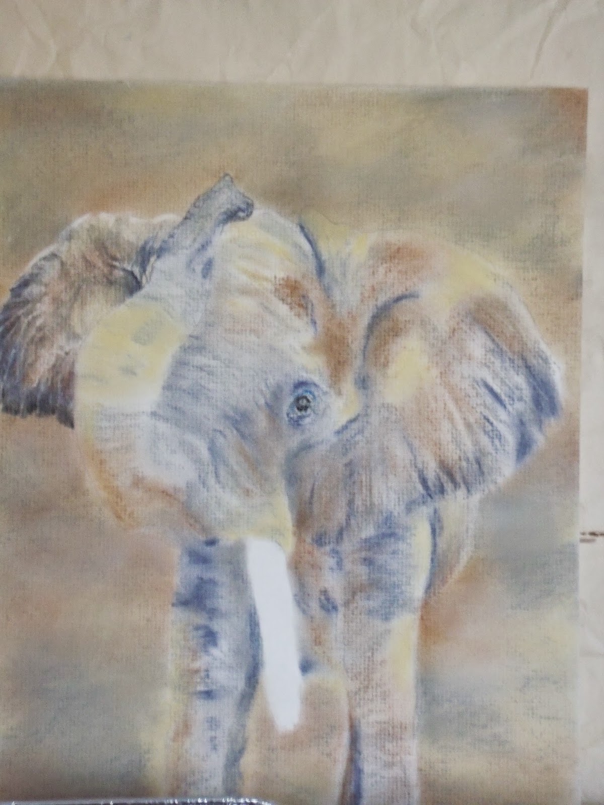
The title of this piece, Bulwagi....Ears is the command that the elephant trainer gave Bulwagi and this is the resulting picture that my husband took.  From this we got the picture and he got a quarter piece of an apple.  Bulwagi is the star of the Birmingham Alabama Zoo's bachelor elephant herd, this is the only zoo herd of males in the world, emulating what happens in the wild naturally.  He is the old man that all the younger males are measuring themselves against and learning from.  The boys spend their days putting their heads together and pushing each other around while they gauge who is the strongest and smartest of all - the dominant male.  And yes, if you notice he only has one tusk, he had an injury when he was young and lost one of his tusks.  This is another experiment, and I am not sure if this is going to be a pastel or graphite painting.  But what I wanted was to create a colorful elephant so I added pastel colors matching the photo values all over the white matbo

Different Challenge

Image
Came back from the mountains all revved up to do a new weaving.  Don't know why, just got the idea, wishing it was Fall and cooler, just wanted to do something relaxing (weaving is very soothing).  So got several reference photos and this will be a Hemlock silhouetted against a blood red sunset, got the best bold variegated yarn with hot pinks, red and orange tones.  Definitely will be bold colors and not for the faint at heart.  You can see my lap loom that I built several years ago with direction from Sandy Adair, a wonderful weaver who makes her home in the Asheville area.  Anyway, this is a relatively slow process, this reflects probably a couple hours of work so far, so will update with a post periodically when there is enough to show something is happening!!  Thanks for stopping by and have a great painting week.

Pool Balls II ACEOs

Image
Well took a short break here and snuck off to the mountains and got some cool weather.  Atlanta has been hot hot hot and humid, sticky, yuk!!  Just happened they had temperatures with lows in the 50s and highs in the 60-70s.  boy, sure could take a whole lot of that. Today I am still working on the pools balls and tried yet another experiment - this time the ACEO is done on translucent matte  Dura-lar  which has a frosty look to it.  You don't want to draw your outline or guidelines on this as they won't erase or disappear.  So I ended up using my drawing pattern, which is on tracing paper, with the mylar clipped on top of it.  You can clearly see the drawing under the mylar and can pull the mylar easily off to color on both sides.  You can compare the one done on black paper with the mylar and see that I got more vibrant color.   The black paper just ate up the color.  I like the black background but need to solve how to get vibrant colors that pop off the black.  I went w