Miss Lulu acrylic study WIP and Question
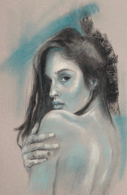
Miss Lulu study WIP

At the Start


Reference


Well this is always where I get hung up, so am asking for help here.

But, first, I have to say that I am used to a world that over promises and under delivers.  I did sign up for my 2019 Lets Face It course and felt I got a really great deal for 50 weeks worth of studies.  But within 3 days after doing signing up, not only have I gotten a coupon for 30% off another course, I have also received two free lessons.  I think that is pretty incredible.   

One of the lessons is on value, this is a lesson over 5 videos.   Kara talks about her process where she uses Stabillo black pencil and white gesso and creates a black and white study.  She works back and forth between the two modeling the face to build up layers of value.  At the end she uses black and titanium acrylic to final notes.   She also incorporates CP, pastel, collage, etc. into her work.

Just an aside, the left of the paper is a collaged napkin that I dropped over to sort of make an interesting background/  Originally I was going to add flowers to this piece, still might just to put some color into the black and white image.  

One thing I have noticed though is that she doesn't get exactly the reference face either.  So I guess here is the question:

When is a painting close enough?
What needs to be changed to make my picture closer to the reference?

Thanks much for stopping by.

Comments

Joan Tavolott said…
I think you did a good job on her face. I have a hard time doing children's faces and always seem to make them look older. The only thing I can see is that in the reference her face below the level of her nose is rounder and wider on the left than you have it in your sketch.
Helen said…
It's a good question. I think the answer depends on our purpose. Does it need to be exactly like the reference? If so, just put a frame on the photograph. Is it a portrait? If so, there does need to be a likeness. Is the purpose to tell a story of a cute little curly haired blonde? I'll have to message you about how I work on getting the likeness closer when I'm working on a face. It's kind of a cheat, but whatever it takes!
carol edan said…
I feel that the reference is for inspiration! At some point we have to put it aside and let our own interpretation take over. That said, with portraits there is the question of likeness. I see you did get a likeness and her personality. I find staying to close to the reference makes for overworking.
An interesting study Nelvia and an interesting problem. I think if your aim is a portrait it is important to have the likeness accurate, otherwise using some artistic license is ok. I find that the collage on the left is a bit too strong and sharp against the solid background on the right. Maybe you can soften it and make it a bit less square. You have two strong focal points and the child should be the strongest. BTW - lucky to get more than you signed up for when it is usually the other way.
Sheila said…
I love the added texture Nelvia. I don't think it has to be exact. It is an artistic interpretation. Unless you are doing a commission, and even then. I would think that is part of the artists stamp. You have captured her sweetness beautifully :)
Nelvia said…
Young Kids faces can get lost so easily because I think we tend to narrow them down. They don't have as many developed indentations and you can either get them too dark making them hard, or too narrow losing the baby fat look. I probably am going to call this over, trash it, and start her again to see if I can do better.
Nelvia said…
I think there is the between, I want it recognizable, but not necessarily caught in the snapshot. Maybe the moment, but the story should be king. Going to sit down today and go through my tutorial for page and see how to control drawing those lines. Also saw a really good group of videos that talk about the square in the face, and comparing angles - so your lines will really be beneficial for me.
Nelvia said…
I don't worry so much if I am just drawing, but some times I want to be more accurate, guess just to see if I can get closer. But watching so many others they really think close enough is good enough - as long as there is some resemblance. I will never be a photo realistic painter, nor do I think I want to. I like seeing people who can do that, but, oh, the patience.
Nelvia said…
Yes, I have softened that with flowers, but I am so down and out on this piece not sure I am going to try to correct - actually I will give it a try if I can figure out how to use page to draw lines on the Mac. Then I can see angles and lines and see if I can get a bit closer. I also have to learn how to be more gray in transition using this technique. I think that the poor transition points also make her look hard and not soft like she should be.
Nelvia said…
She is such a cutie and I am going to definitely try her again. Right now will start again probably with charcoal and go through to painted piece. Maybe more familiarity will help??

Popular posts from this blog

Bold woman's portrait

Her Highness mixed media woman portrait

In The Garden acrylic painting Redo