Zorn Color Chart

Did I do it the same way someone else would have? Heck I don't know if my parts were correct, but what I did learn is that I believe with the notes on the chart I can get to these colors again. And from these colors I can make new ones by making modifications. I guess what I am saying is I think it is repeatable.
I have been making color charts for a while now but this one finally makes sense to me. I find that it gives me more colors rather than just tints as many traditional charts do - no I don't have a 9 step scale, but I have enough to determine if I want to go between the %s I show on this chart. I think it is great to see what additional colors do - you get your complements and also see what happens when you add black. You can find a much better how-to-do it at michaellynnadams.com or put in Zorn palette and you will get other options. This is the Zorn palette, or my first version. It is 3 colors plus white: I used Cad Red Lt, Yellow Ochre, and Ivory Black plus Titanium white.
The top half is adding white from 80% pure color down to 5%. The bottom half - at least the way I perceived it - is using the same colors tinted with the white % then adding a trace of the color that wasn't used, either black, red or yellow. You can see on Michael's website a much clearer set up than this.
Yes it does take time and is tedious, but you do get into a flow. What are the positives of taking the time to do this:
1) Feel more comfortable with the palette knife, both in mixing and putting on the paper
2) I feel I have a better viewpoint of the four colors I am going to be working with and an expectation of what combinations will make the color I want
3) It is really important to put the colors together in the manner described, if it is Y:B, I finally figured out it is important that you put the black into the yellow. At the other end it is B:Y (yellow into the black) and yes, I think it does make a difference in the end color result.
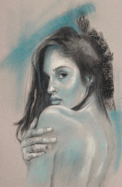
4) Since I wanted to do this prior to doing another portrait I feel like I am in great shape to do my next portrait project. Just look at all those flesh tones, grays, and shadow tones.
5) This is a very limited palette and the picture should look cohesive because all the shades will be mixed from the same colors.
6) This is only the tip of the iceberg as other colors can be created from changing the amounts
7) It also makes you begin the first step of asking what colors and proportions does a specific color have for when you are trying to match paints on photos or from life
What are the negatives:
1) If I change out just one color I have to do another sheet all over again - time is the factor. But I really do need to see how it changes the structure of things and colors you get
2) In this particular palette I don't see a lot of browns so I will have to for more work to find them in these colors or add an additional color like Burnt Sienna, Raw Sienna or Burt Umber.
3) Because I had to cut the 3M painters tape I did the set up sheet yesterday with the blocks and tapes. So the tape was probably on for 24 hours and yes, it did stick in places when I went to pull it off. This is on a watercolor paper and the tape did adhere pretty good as I have very few places where it leaked under the tape, this isn't real rough watercolor paper but not entirely smooth either.
4) I used more paint and paper towels than I have in the last 4 paintings I have done. But I got a better feel for the paints themselves and how much you get on the surface.
5) Use those paper towels and make sure you keep your colors and palette clean. Just a little of the wrong thing will influence the end result.
In summary yes I will do this again for more colors as I try to determine what palette works best for me. Thanks for stopping by, sorry it's long and have a super week.


Comments