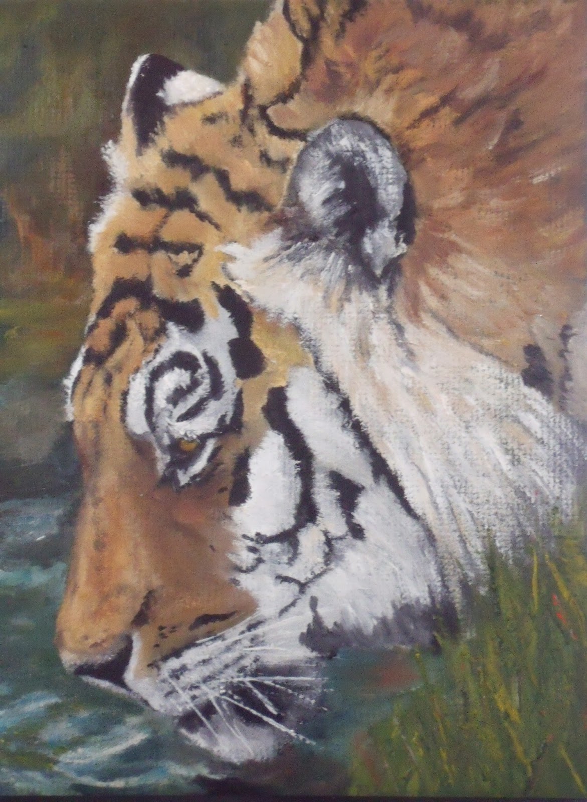
Thirsty

                                                                         Thirsty
                                                                          8"x10'
                                                                            Oil
Still trying to stay in the groove of finishing pictures in shorter time frames.  Funny in the challenge I didn't fear it wouldn't turn out, I just went with it and what happened, happened.  But right away, without the pressure I find myself being hesitant.  Got to remember it's only paper, mat or canvas and it isn't a gold brick I'm working on or with.  With each one of these I learn something else, liking some things about this and not others.  I find myself with flat brushes and think that I would prefer filberts and want to go back to smaller brushes that I think I could control.  Going from 5"x7" to 8"x10" doesn't sound like a lot, but I found it is a big difference.

And one thing is I am not a fan of greens.  Don't know if it is because I have only 1 yellow and two blues, but getting varying greens is tough for me.  Even though this is kind of abstract I think I like a pure abstract background better.

There also is definitely a trick to how you go about working with oils.  I find I almost need to do layers so that I have certain areas overlapping the under layer so you can get softer edges.   Blending on the picture with oils doesn't mix like I thought, like pastels, the top color kind of overtakes the bottom color.  I am purposely letting it dry for a day and then going back over it because it isn't as tacky the next day.  Hoping that as I do a few more pictures I will be able to figure it out.  I am trying to go loose but am fighting it all the way.  Seems like I always revert to tight and details.

Also going to go to Artgraphica and work through several of their tutorials to see if that will help too.  At least I might learn some techniques.

Thanks for stopping by and have a great week.


Comments

Wow heel erg mooi Nelvia lieve groetjes Daniëlle
This is looking wonderful.
Nancy Goldman said…
This is really beautiful Nelvia and I really like the background. Your work in oils is lovely.

I've never heard of Artgraphica. I will have to check it out.
It is looking good. About the greens - try adding some red, raw sienna or orange to change the shades of green. I like greens - there are so many of them
Nelvia said…
Thank you Danielle, now that I have more time got to come visit your site and catch up
Nelvia said…
Thank you C, I am pretty happy with this. More I look at it I am liking it more. Still wish I could get looser.
Nelvia said…
This is the crazy thing I have been dismal at oil until trying again in the challenge. Hence reason my oils dried out as they have just sat. Go figure. Good to hear from you Nancy
Nelvia said…
Hi Val, yes I will try your suggestions, have a bit of those colors in the grasses, but very subtle, guess I need to get my internal vision adjusted for loose and color spices added to kick it up.
hmuxo said…
You did such a wonderful job on this lion, Nelvia...Beautiful colors and pose...your work with oils is just as good as when you work with pastels....!! I love the background as well. I hope you don't get 2 comments...I had problems with posting today!!!
Tam Foree said…
This is really nice Nelvia. Lovely lush brush work and no a lot of tightness. I like that. I like this piece a lot!!! I was going to agree with you on your green comment and then read Mellowood's comment about adding red, raw sienna and orange to them. I do make a green from yellow ochre and Ivory black that I like. It is kind of olive in color. Thanks for the tip about artgraphica, too. Will check it out!! Have a great day!!!

Popular posts from this blog

Bold woman's portrait

Her Highness mixed media woman portrait

In The Garden acrylic painting Redo