Friction acrylic Frictionabstract

Friction
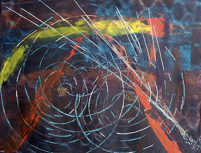
DAY 6  Well this kind of felt like it was throwing off sparks, so hence the title.  It was a lucky accident that I had this taped to a large piece of cardboard.  So when I squeegeed the first layer on it picked up the texture of the cardboard underneath.  It shows quite a bit more in real life.  Then I used a credit card that I cut like a comb to make the circles.   Since it didn't show enough alternative color I went back in with the turquoise and white to give it a bit more flare.  Still seemed a bit dark and drab so went with increasing the yellow and added more cad red to pump it up.

Thanks much for stopping by.  Any comments are welcome as I am just learning about abstracts and got no clue.   Just following the impulses.

Comments

Joan Tavolott said…
I like the textures you have in this. I appreciate reading the process you used. Not being an abstract person I look at abstract pieces and usually have little/no idea how they were done. It is great that you went back into it and added more color to pump it up!
Nelvia said…
Yes with my abstracts I sure don't want them to be blah. Some people can do analogous and make it look like something but I want color. And since I am in charge, baby, I get color!! Whew feel better now that I said that. We'll see what the next one brings, I have an idea and think it will be interesting.
carol edan said…
You have a bull's eye! Love the colors and movement!
Sheila said…
Love the blue swipes and the pattern revealed. Love that uneven circles, very dynamic. It is very dark, but I think you added just enough. Lots of energy here :)
Wow! You are really going to town with this one. I like the circles and the 'sparks'. I often wonder if there are rules for abstracts as so many of the videos I have watched don't seem to agree on things. Jus tgo with the flow girl!
Nelvia said…
Thank you Carol, looking at your work is helping
Nelvia said…
I still think I am in the new house with north light that everything is darker, but this does have burnt sienna and turquoise so it got pretty dark. I like the energy in this as well
Nelvia said…
I keep thinking there has to be rules, fundamentals, a reason why this color goes there instead of here. I think the golden mean still applies but they seem to like multiple focal points, so I just don’t know. No one has told me I am doing it wrong, but shouldn’t you sort of know,what you are going to end up with. I am to keep on going and see where it takes me

Popular posts from this blog

Bold woman's portrait

Her Highness mixed media woman portrait

In The Garden acrylic painting Redo